


-

Low Starting Quantity
-

Digital Proof Included
-

Design Support Available
-
In-House Production
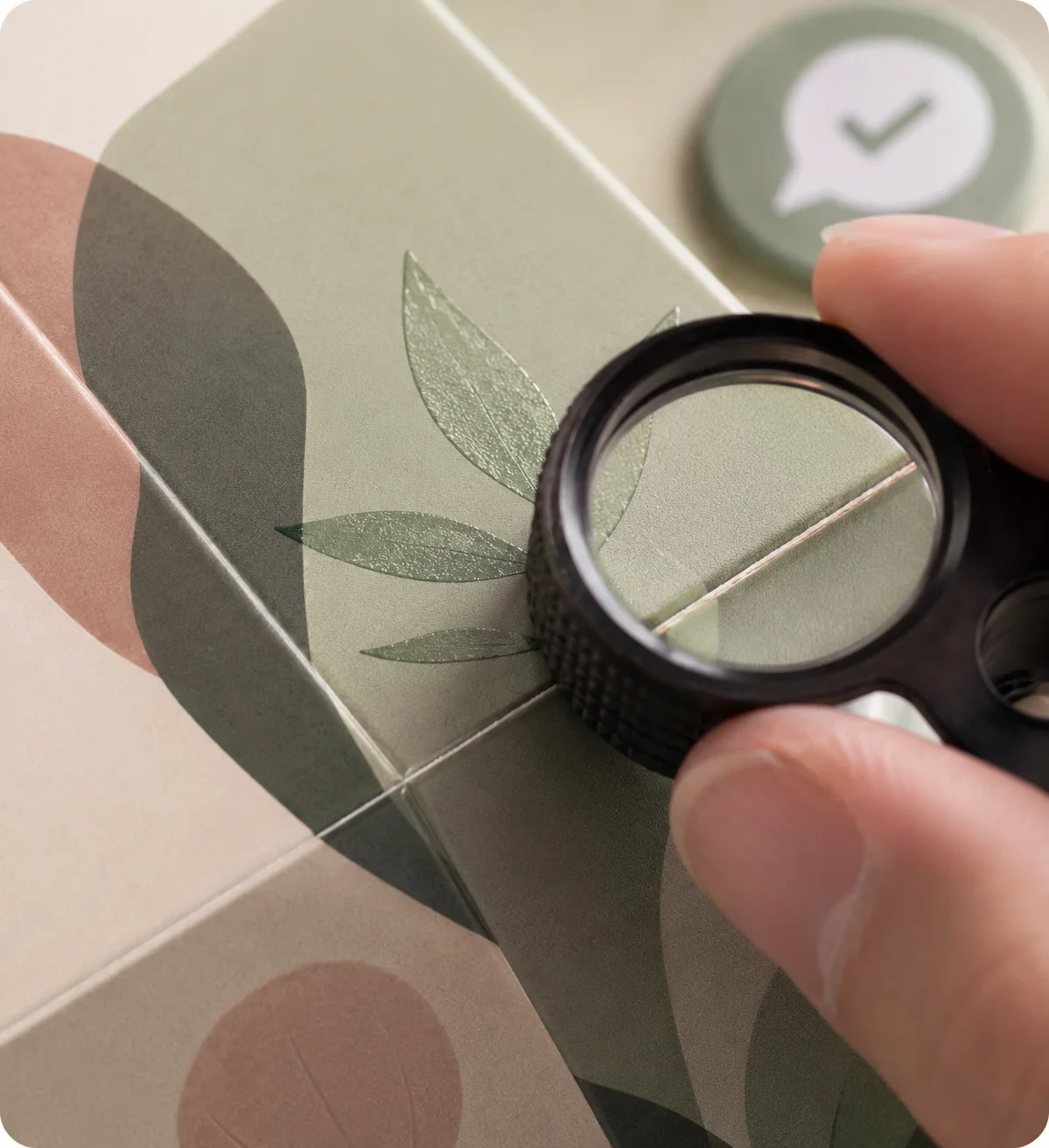
Custom textured finish boxes help customers feel your intended quality before they examine every detail, giving the package a deliberate, recognizable character at first contact. In a crowded retail display, product photograph, gift handoff or delivery arrival, customers often decide what a package suggests within moments. A carefully planned tactile finish changes that first reading by adding surface contrast, depth or softness where it supports the design. Instead of treating texture as decoration, use it to make the brand mark easier to notice, give selected information more weight and make the box feel consistent with the product’s intended standard. We build custom textured finish boxes around the impression your product needs to create, whether the goal is a refined retail pack, a substantial gift box, a confident launch kit or a more considered delivery experience. The result is packaging planned as one connected customer touchpoint, not a standard box with an isolated effect added at the end. Your project can bring structure, material, full-color or spot-color printing, inside and outside artwork, embossing, debossing, raised spot effects, foil, soft-touch treatment, inserts and dieline support into one coordinated plan. Each choice is reviewed against the box style, handling needs and artwork so the tactile detail supports recognition, product arrangement and opening rather than competing with them.

Get Custom Quote
STRUCTURES THAT CARRY FEEL
Choose a Box Style That Makes Texture Count
Texture has more impact when the structure gives it a clear job. A folding carton may use tactile contrast to guide retail attention, while a rigid box can use surface feel to support gifting, launch kits or high-consideration products. Sleeve and mailer formats create different handling and opening moments, so the same finish plan should not be applied to each without adjustment. Choose the route by what the box must hold, how customers will meet it and which surface they will see or touch first. The right structure turns texture into part of the customer experience rather than an added decorative layer.
➜
Folding Carton Boxes
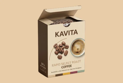
A folding carton gives textured details a clean, efficient surface for retail products, small sets and branded ranges. Apply the effect selectively so product information remains clear while the box gains a more deliberate physical character.
- Single-product or range packs
- Tuck or lock-bottom structure
- Selective tactile brand cues
- Retail and handoff ready
A practical route for combining clear product communication with a more distinctive surface experience.
Customize Now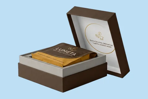
➜
Rigid Presentation Boxes
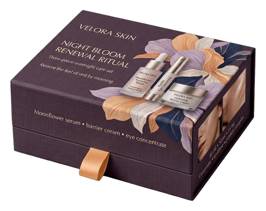
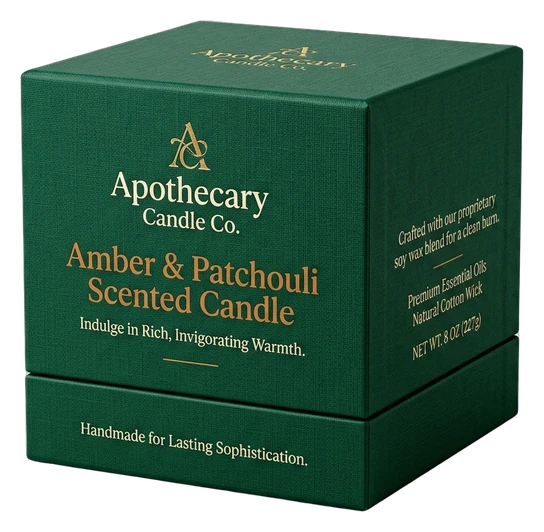
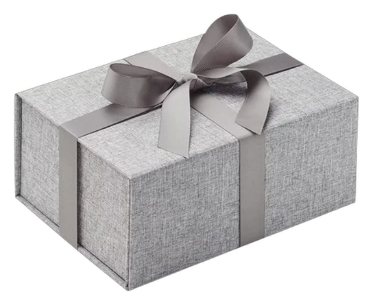
Rigid construction gives gift sets, launch kits and carefully arranged products greater physical presence. Wrapped surfaces, linen material, embossing, debossing or raised details can help the exterior feel consistent with the importance of what is inside.
- Gift, kit or product sets
- Two-piece or magnetic closure
- Wrapped or linen character
- Guided lift-out and reveal
A substantial format for projects where touch, arrangement and opening need to support the same brand standard.
Customize Now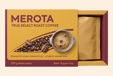
➜
Sleeve Boxes
A sleeve creates a natural handling sequence as the customer holds, slides and opens the package. The outer surface can carry tactile emphasis while the inner tray or product arrangement continues the intended visual character.
- Single items or grouped sets
- Sleeve-over-tray arrangement
- Texture across the outer sleeve
- Retail, gifting or PR handoff
A useful choice when the movement of opening should reinforce the finish rather than interrupt it.
Customize Now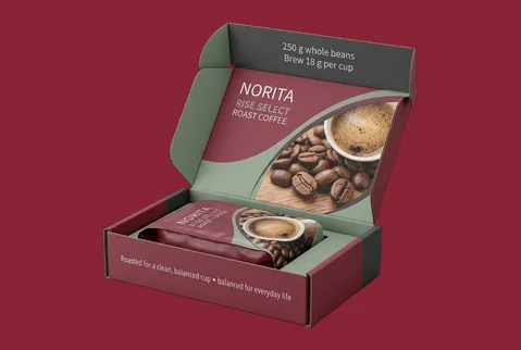
➜
Branded Mailer Boxes
A branded mailer can carry tactile cues into delivery arrival and first access. The finish route should be confirmed against the selected board, flute, artwork and structure so the surface treatment remains appropriate for handling.
- Product, kit or subscription packs
- Roll-end mailer structure
- Tactile detail where suitable
- Delivery arrival and first access
A coordinated route for extending recognizable package character from shipment receipt into product discovery.
Customize NowMATERIAL SETS THE BASELINE
Build Texture on the Right Physical Foundation
A tactile effect cannot be planned separately from the material beneath it. The board establishes whether the finished box feels smooth, natural, substantial or more utility-led before embossing, debossing, raised effects or soft-touch treatment are considered. Paperboard can support controlled print and finish contrast, kraft contributes its own visible material character, and rigid greyboard gives wrapped boxes greater physical presence. Corrugated material serves relevant mailer, kit and product-box formats where structure and arrival matter. Select the material by the customer impression and handling situation it must support, not by thickness alone.
Smooth Paperboard for Controlled Contrast

Paperboard and cardstock provide a clean base for detailed artwork, controlled brand colors and selective tactile effects. This makes it easier to distinguish the areas that should communicate information from those intended to attract touch or guide attention. The result can feel precise and deliberate without making the surface unnecessarily busy.

Kraft for Natural Surface Character

Kraft already communicates a visible, material-led character. White ink, full-color artwork and selective raised or recessed details can help the brand remain clear while allowing the kraft surface to stay part of the design. It suits brands that want the board itself to contribute to the customer’s first interpretation.
Rigid Greyboard for Greater Physical Presence

Rigid greyboard supports boxes intended for gift sets, launch kits, product collections and carefully arranged items. Different wrapping materials, including linen options, can shape the tactile character before additional finishes are introduced. The structure also creates room for coordinated inserts and a more controlled product reveal.
Corrugated Material for Branded Arrival Formats

Corrugated board can give relevant mailer, product, presentation and kit boxes a more substantial handling character. Its exact printing and finish route should be confirmed against the flute, structure, artwork and intended use. This keeps the customer-facing design connected to the practical demands of delivery and opening.
PRINT GIVES TEXTURE MEANING
Make the Tactile Detail Serve the Brand
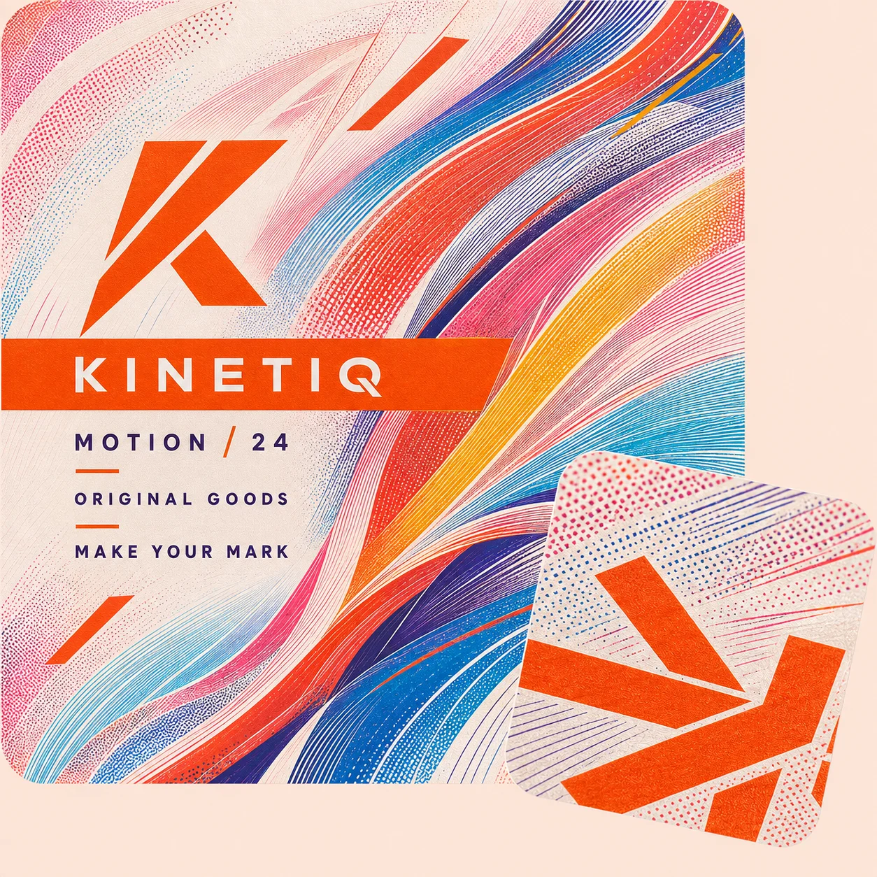
Texture becomes more useful when customers understand what it is drawing attention toward. Printing establishes the product name, brand colors, variant information, campaign message or collection identity; the tactile treatment then gives selected elements greater physical emphasis. CMYK, spot-color and full-color printing can carry the visual system across the outside or inside of the box, while white ink can keep artwork visible on kraft. Digital, offset and flexographic routes are available for appropriate specifications. The purpose is not to cover every panel with effects, but to make the brand easier to read and recognize across retail, gifting, photography, handoff or delivery.
- Give the brand mark tactile importance
- Keep product information easy to read
- Separate variants without losing continuity
- Carry artwork beyond the front panel
- Use inside print where opening matters
- Coordinate color, texture and structure
TACTILE DETAILS WITH PURPOSE
Control What Customers Notice and Feel First
A textured box works best when each surface treatment has a defined customer-facing purpose. Adding embossing, foil, raised effects and lamination without a clear hierarchy can make the design harder to understand rather than more valuable. Begin with the overall character the package should communicate. Then decide which brand, product or occasion details deserve greater visual or tactile weight. Matte, gloss, soft-touch, spot UV, foil stamping, embossing and debossing are available tools, but the business value comes from using the right effect in the right place.
-
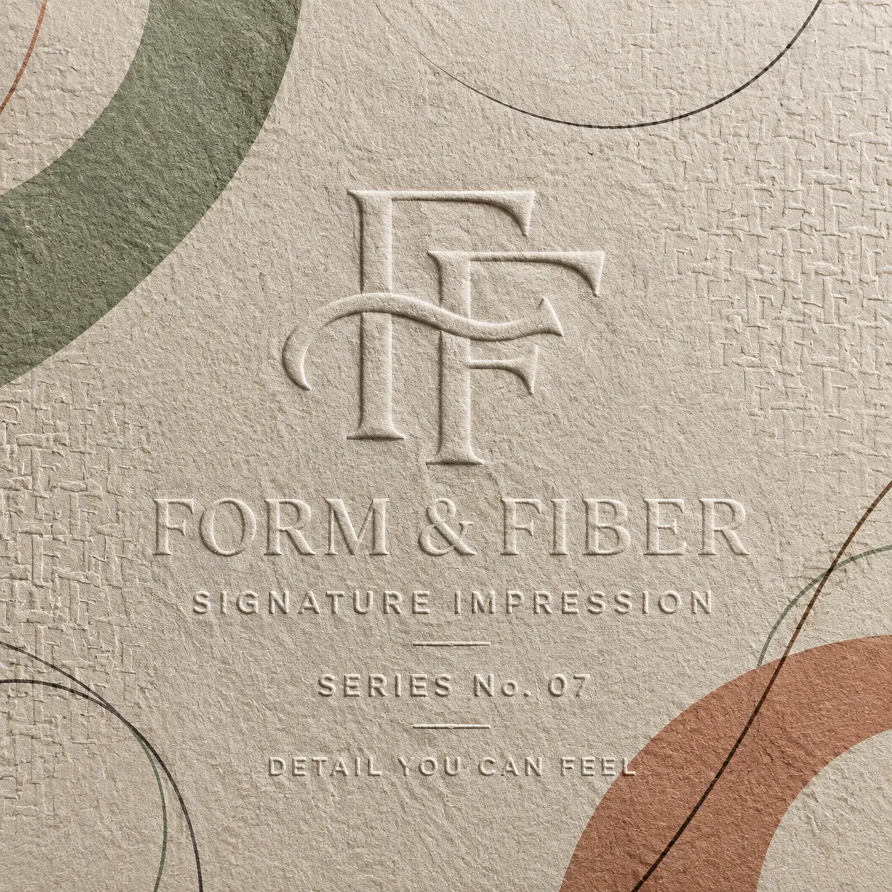
 Establish the Overall Feel
Matte or soft-touch treatment can give the package a calmer, more considered surface character. Gloss can support brighter artwork and stronger visual clarity where the brand calls for more energy. The choice should match the product’s intended personality and the environment in which customers will handle the box.
-
Give Important Details More Weight
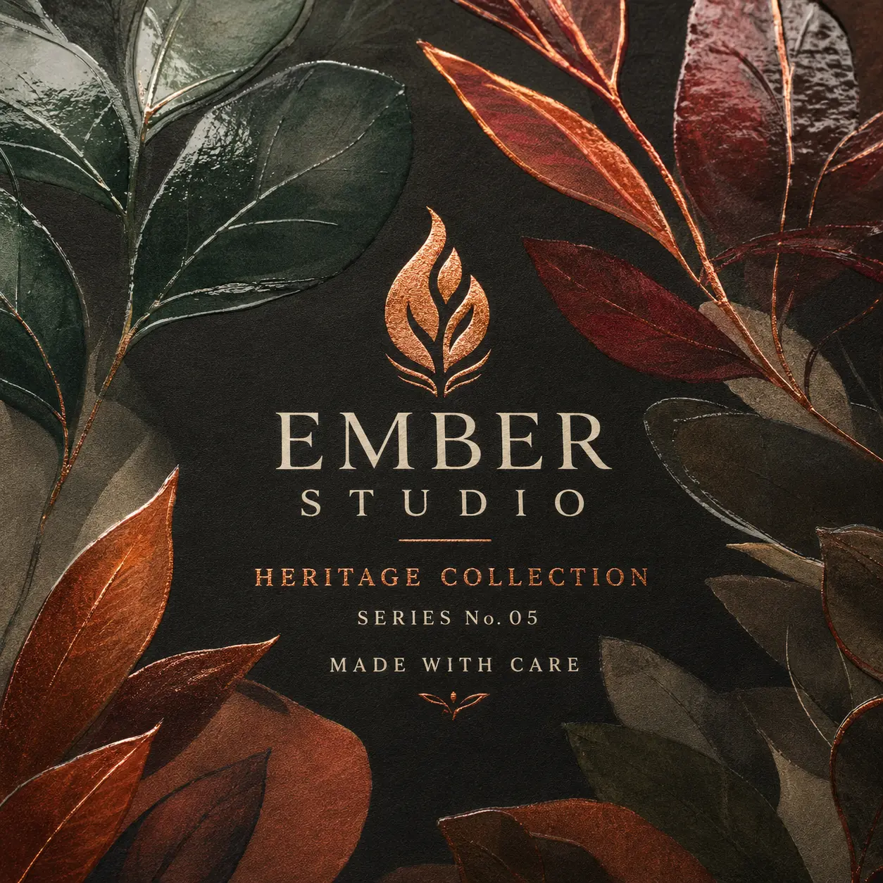
Embossing, debossing, raised spot UV or selective foil can bring the brand name, product title, pattern or key message forward. The purpose is to create an understandable order of attention. Customers should be able to sense which details matter without the treatment competing with necessary information.
-
Distinguish Special Editions
Seasonal launches, gift ranges, collaborations and limited editions can use selective surface contrast to feel distinct from the core range. Retaining consistent brand colors, typography or structural cues helps the special edition remain connected to the parent identity rather than appearing unrelated.


CARRY THE FEEL THROUGH OPENING
Keep the Experience Coherent After First Touch
A tactile exterior establishes an expectation, but the impression can weaken when the inside feels disconnected or the products appear loosely arranged. For gift boxes, launch kits, mailers, sleeves and coordinated product sets, the interior should continue the same level of care established outside. Inside printing can maintain visual continuity, while foam, paperboard, kraft, cardboard or corrugated inserts can give products and components a deliberate place. The goal is not to create unnecessary theatre. It is to make receipt, opening, identification and product removal feel clear, connected and appropriate for the selected structure.
-
Continue Carry the Identity Inside
Use relevant colors, artwork or concise messaging on the inside surfaces so the brand does not disappear when the box opens. This is especially useful when delivery, gifting or product photography makes the interior part of the customer experience.
-
Guide Give Every Item a Clear Place
Use inserts, dividers or trays to organize single products, sets and components around the intended viewing and removal sequence. A considered arrangement helps customers understand what they have received and how the items relate without unnecessary searching.
-
Reward Shape a More Considered Reveal
Control what becomes visible first and how the product is lifted, slid or selected. Rigid, sleeve, mailer and kit formats can support different reveal sequences, so the opening plan should follow the actual structure rather than force the same experience onto every box.


EXPERT-GUIDED TEXTURED PACKAGING
Textured Finish Box Customization Made Easy & Fast — Built for Touch, Depth & Premium Surface Appeal
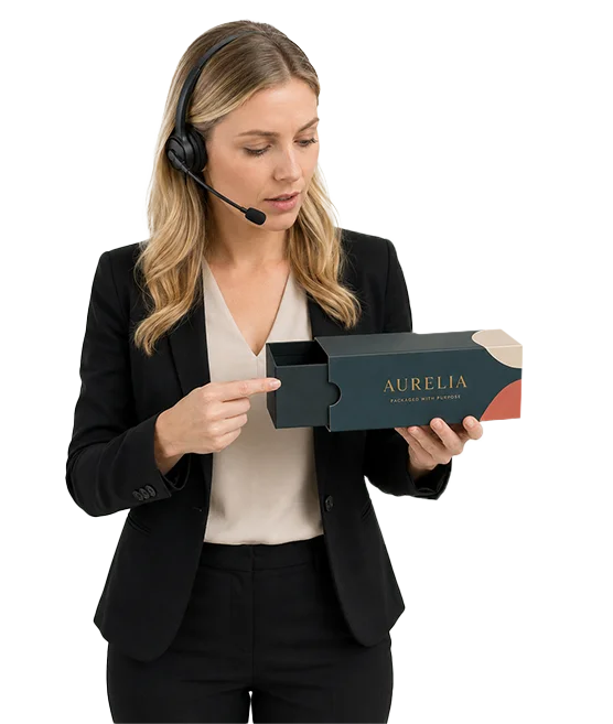
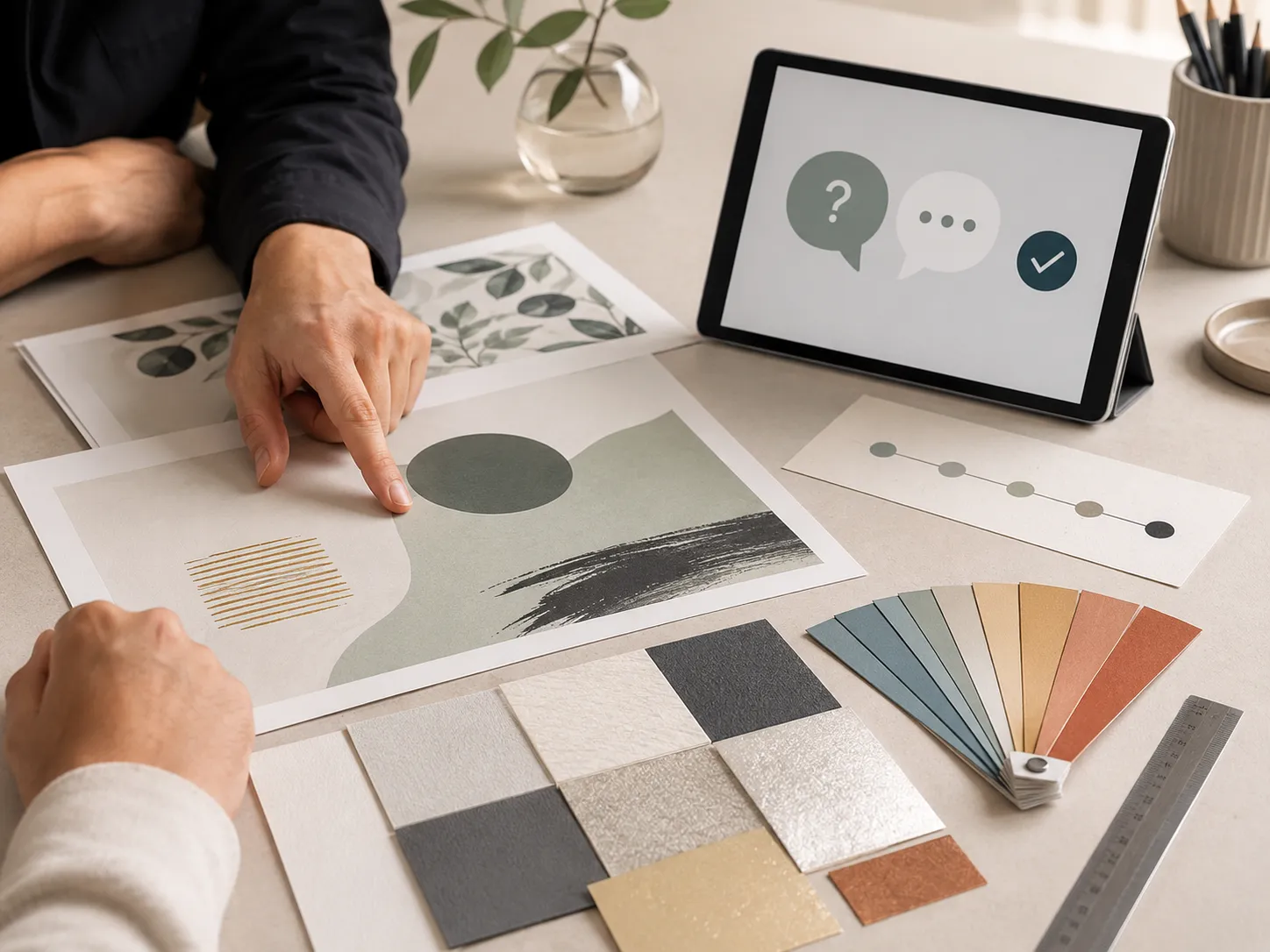
Our textured finish packaging experts, structural designers, print specialists, consultants, and project managers make custom textured finish box ordering easy and fast by bringing your product dimensions, selected box style, board stock, artwork, surface texture direction, coating base, finish combinations, and brand direction into one production-ready structure. We guide product fit, stock thickness, texture method selection, raised or recessed finish feasibility, soft-touch, linen, grain, matte, embossing, debossing, UV, and foil pairings, fold and edge clearance, rub exposure, coating compatibility, artwork masks, dieline alignment, bleed and safe-zone setup, cost calculation, timeline planning, prepress preparation, and 3D proof review. The result is a textured finish box that fits correctly, feels intentional in hand, supports premium retail or gift presentation, and moves to production with fewer texture, alignment, structure, or approval risks.
-
Fast
Texture Specs-to-Quote Alignment
Experts align box size, selected structure, board stock, texture method, coating base, finish masks, cost, timeline, prepress setup, and 3D proof early — helping reduce quote delays and repeated surface-finish revisions.
-
Exact
Surface Texture & Placement Review
We check texture coverage, logo placement, pattern scale, fine details, panel edges, folds, trims, glue areas, and registration tolerance so the selected texture lands more accurately on the finished box.
-
Tactile
Stock, Coating & Touch-Point Check
Specialists review paper surface, stock thickness, coating base, raised UV, embossing, debossing, soft-touch, rub exposure, and handling areas so the texture feels premium without weakening the box or hiding artwork.
Plan a Textured Box That Works Beyond the Sample View
A tactile effect should support the product in real handling, not only look appealing in an isolated design preview. The most successful planning process connects product fit, structure, material, artwork, finish placement, quantity and production timing before the order moves forward. The following considerations help reduce uncertainty and turn the intended brand impression into a production-ready specification.
-
Define What the Box Must Hold
Begin with the product rather than a standard box size. Provide the product’s length, width and height, along with any irregular shape, inner container, wrapping, accessory or grouped-pack requirement. For sets, confirm the item count and preferred arrangement. Inserts and dividers also need enough space for product placement and practical removal. The structure can then be planned around fit, presentation and handling. This avoids inventing generic dimensions that may not suit the actual product. It also helps determine whether paperboard, kraft, rigid greyboard or a relevant corrugated format is the more appropriate physical base.
-
Match the Structure to the Customer Moment
Consider where customers will meet the package and what they need to understand at that point. A folding carton may be appropriate for retail products or compact ranges. A rigid two-piece or magnetic box may better suit gifting, launch kits or carefully arranged sets. A sleeve can create a guided sliding action, while a mailer can carry the brand into delivery arrival and first access. One format does not need to serve every channel. A project may prioritize retail, gifting, product photography, PR handoff or delivery, with supporting channels considered only where relevant. Large commodity shipping-carton positioning should be handled separately from branded mailer, kit, product or presentation-box needs.
-
Build a Tactile Hierarchy, Not a Finish List
Identify the first surface customers will see and the first area they are likely to touch. Then decide which element deserves emphasis: the logo, product name, pattern, campaign line, variant cue or special-edition detail. Selective texture often creates a clearer result than applying multiple effects across every panel. Matte, gloss or soft-touch treatment can establish the overall surface mood. Embossing, debossing, foil or raised spot effects can give specific details more weight. A linen or other approved overwrap can shape the baseline character of a rigid box. These choices should be evaluated together so the finish supports the intended impression without reducing legibility.
-
Prepare Artwork for Print and Texture
Artwork and dieline support are available to help place panels, folds, bleed areas, safe zones and finish elements correctly. Accepted production files include AI, PDF, PSD and EPS. Existing artwork can also be checked or resized for confirmed dimensions. Keep printed artwork and special-finish areas clearly identified in the production file. This helps the team evaluate registration, coverage and the relationship between the tactile effect and surrounding design. A digital proof is available for every approved order, and production does not begin before the required artwork and structure approvals. No die or plate fee applies to supported work.
-
Plan Quantity, Pricing and Prototypes
Paperboard, cardstock, kraft and supported corrugated orders may start from 50 boxes. Supported rigid-box orders may start from 25 boxes, including relevant rigid styles with inserts. Starting with a lower quantity does not automatically remove meaningful customization choices, although every option remains subject to the approved structure and production specification. Per-unit pricing generally improves as quantity increases, with more visible price differences often appearing around 500 units. A physical prototype may be available for a qualifying bulk or wholesale project. Where approved, its cost may be adjusted into the resulting order. This should not be presented as an unrestricted free sample or a one-box production service.
-
Confirm Production and Delivery Planning
Production normally takes 4–6 business days after payment, final artwork approval and structure confirmation. Production-ready jobs are generally planned to print and ship within 7 business days. Shipping transit time is separate, while complex multi-design orders may require a separately confirmed schedule. Confirm deadlines before production when the project includes many designs, special setups, rigid construction or corrugated material. One order may also be shipped to multiple addresses, which can support coordinated launches, gifting programs or distributed teams when those delivery details are supplied during planning. A clear brief does not need to contain every technical answer. It should explain the product, desired customer impression, intended channel, quantity and required timing. The packaging team can then help translate those priorities into a suitable material, structure, artwork and tactile-finish plan.

TEXTURED BOX QUESTIONS
Answers Before You Choose, Proof and Order
The tactile effect can come from the material, the surface treatment or a selective raised or recessed detail. Supported options include soft-touch treatment, embossing, debossing, raised spot effects, foil and wrapped rigid-box materials such as linen. Matte and gloss treatments can also help create surface contrast. The right option depends on what customers should notice or feel first, the selected box material, the artwork and how the package will be handled. The team can help narrow the choice before the final specification is approved.
Yes. Texture can be focused on a logo, product name, pattern, border, campaign message or another selected design element. Embossing, debossing, raised spot UV and selective foil are useful when one area needs greater visual or tactile weight. A selective approach can keep product information clear while making the most important brand cue easier to notice. The exact coverage and placement are confirmed through the artwork, dieline and proofing process before production.
Paperboard, cardstock, kraft and rigid greyboard are supported bases for relevant tactile and decorative treatments. Rigid boxes can also use different wrapping materials, including linen, to establish a textured physical character before other effects are added. Corrugated material is available for relevant mailer, product, kit and presentation formats. Because flute, structure and handling affect the surface, the exact finish route should be confirmed for the selected corrugated specification rather than assumed in advance.
Yes. Textured finish boxes can combine tactile details with full-color, CMYK or PMS spot-color printing. Artwork may be printed on relevant outside or inside surfaces, and white ink is available for kraft where the design needs clearer contrast. Digital, offset and flexographic printing routes are available for appropriate jobs. The printing method is selected according to the material, structure, quantity and artwork so the color and tactile treatment operate as one coordinated design.
Yes. A smaller brand can begin with packaging planned around its own product and intended identity without committing to an unnecessarily large first run. Paperboard, cardstock, kraft and supported corrugated orders may start from 50 boxes, while supported rigid formats may start from 25. Relevant sizing, printing, finish, inside artwork and insert options remain available where they suit the approved structure and production specification. This gives emerging brands room to test a launch, prepare a promotion or introduce a gift range without relying on generic stock packaging.
Guidance is available for preparing the artwork, dieline and finish placement. AI, PDF, PSD and EPS files are accepted, and support is available for artwork checking, resizing, bleed areas and safe zones. Clearly separate or identify the areas intended for embossing, debossing, foil or raised effects. A digital proof is available for every approved order so the layout, structure and relevant production details can be reviewed before printing begins.
A physical prototype may be available for a qualifying bulk or wholesale project. Where approved, the prototype cost may be adjusted into the resulting production order. This is not an unrestricted free-sample or one-box service. Availability depends on the project, quantity, structure and production requirements. Every approved order does receive a digital proof, which is separate from a physical prototype and is used to review the production layout before printing.
Production normally takes 4–6 business days after payment, final artwork approval and structure confirmation. Production-ready jobs are generally planned to print and ship within 7 business days. Shipping transit time is separate. Projects with many designs, complex setups, rigid construction or corrugated material may need a separately confirmed schedule. Timing should therefore be agreed during planning rather than treated as guaranteed delivery within seven business days.
CUSTOMER SUCCESS STORIES
Hear What Our Customers Say

As a small business, finding premium finishes in lower quantities was always difficult. Global Custom Packaging gave us the freedom to customize our boxes and create the distinctive, polished look we wanted without committing to a large order. We still work with them today and have expanded into multiple product variants, each with the same impressive presentation.
Jordan Blake
We sell online and in stores while regularly promoting at major events, running influencer campaigns, and launching seasonal collections. Thunder Packaging has become our dependable source for everything—from premium mailer and product boxes to sturdy influencer kits, rigid packaging, kraft boxes, and limited-edition Christmas designs. Whatever structure, material, or branded look we need, we no longer have to go anywhere else.
Avery Quinn

I never worry about how my packaging will look or whether my artwork contains typos, incorrect bleed areas, or other design errors. Their 3D previews and helpful design support give me confidence before printing. If the team notices a problem, they contact me, correct it quickly, and never charge extra for the assistance.
Cameron Reese
I’m really impressed with Global Custom Packaging’s precise, richly saturated printing and the accuracy of their die-cutting. The boxes were produced in exactly the right size, with a clean, well-formed structure and no fitting or construction issues. The finished packaging looked polished, consistent, and ready to represent our products professionally.
Morgan Taylor
I received my quote within a few hours, and once we agreed on the price, the designer responded quickly, completed the required changes, and prepared my artwork for printing. The 3D proof arrived promptly, allowing me to review everything and place my order that same day. My packaging was delivered on time, exactly as Global Custom Packaging had committed.
Harper Lane