


-

Low Starting Quantity
-

Digital Proof Included
-

Design Support Available
-
In-House Production
Turn every formula into a clearly recognizable product, with packaging that presents the brand confidently, organizes important information and makes receiving or opening feel considered. Customers often compare nutraceuticals before they fully understand the formula inside. In that brief decision window, your box must help the product feel professionally presented, easy to identify and connected to the rest of the range. Custom sizing, controlled printing, purposeful finishes and a structure built around the bottle, jar, blister pack or sachet can create that clarity. The result is a package that supports confident selection on a shelf, during a practitioner handoff, in a subscription delivery or when a wellness kit is opened. We build custom nutraceutical boxes around the product, the information customers need to see and the brand impression you want to establish. From straightforward retail cartons to rigid presentation kits, the service is shaped to keep the range consistent while giving each formula, strength or use occasion its own clear place. That outcome is developed through more than artwork alone. We can plan the structure around the product dimensions and pack count, select paperboard, kraft, rigid or relevant corrugated formats, print across outside and inside surfaces, and use finishes or inserts where they add a real purpose. Artwork checking, dieline support and a digital proof help connect the approved design to production before the order moves forward.

Get Custom Quote
STRUCTURES FOR EVERY FORMULA
Match the Box to the Product and Customer Journey
Not every nutraceutical product should enter the market in the same box. A single bottle needs a different structure from a 30-day sachet program, multi-formula starter kit or subscription set. The right route depends on product dimensions, weight, pack count, selling channel, information space and how the customer should meet the product. Choose a close-fit folding carton for efficient retail presentation, a stronger bottom for heavier containers, or a tray, insert or rigid format when arrangement and reveal carry more value. Each option below can be adapted to the product and approved production specification.

➜
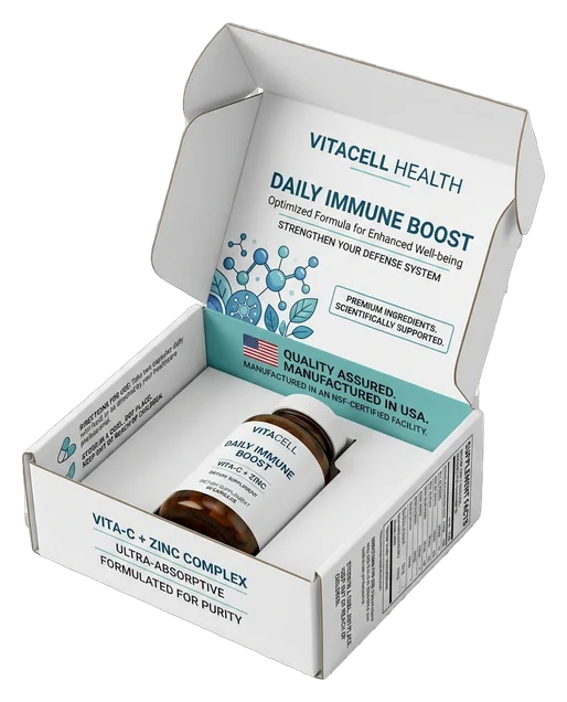
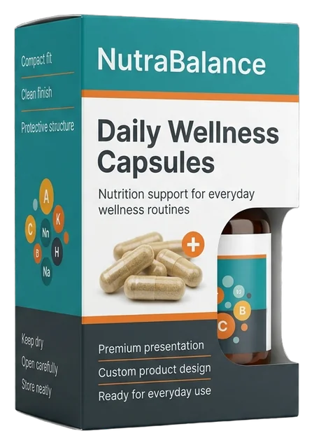
Straight Tuck Bottle Cartons
A close-fit straight tuck carton gives one bottle or jar a familiar retail form while reserving broad panels for formula identity, brand cues and buyer-supplied product information.
- Single bottle or jar pack
- Close-fit paperboard structure
- Full-panel brand system
- Retail and handoff ready
A practical route for keeping everyday products recognizable without making the package feel generic.
Customize Now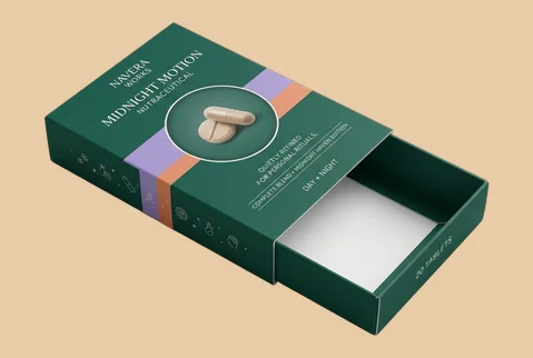
➜
Reverse Tuck Retail Boxes
Reverse tuck construction places the top and bottom closures in opposite directions, giving compact nutraceutical packs an efficient structure with room for clear variant and range navigation.
- Compact bottle configurations
- Opposing tuck closures
- Front-to-side visual continuity
- Shelf and counter suitability
Useful when a compact carton needs orderly brand communication across several visible panels.
Customize Now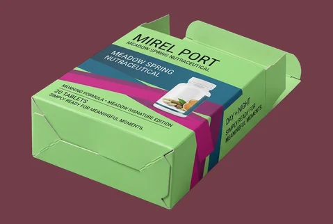
➜
Auto-Lock Bottom Cartons
An auto-lock bottom adds assembly efficiency and a more supportive base for heavier bottles, jars or bundled units while keeping the exterior available for consistent product-family branding.
- Heavier bottle or jar packs
- Pre-glued bottom structure
- High-coverage exterior printing
- Retail and direct delivery
It combines a stronger base with the clean branded surface expected from a folding carton.
Customize Now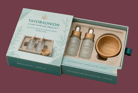
➜
Sleeve and Tray Packs
A printed sleeve around a sliding tray introduces the product in stages, making it useful for launches, sample programs and focused wellness sets that need a more deliberate reveal.
- Single or grouped products
- Sliding tray arrangement
- Outer-to-inner brand continuity
- Launch and gifting moments
The controlled reveal gives compact collections a more intentional first introduction.
Customize Now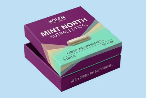
➜
Two-Piece Presentation Boxes
A separate lid and base create a clear presentation surface and a composed lift-off opening for nutraceutical bundles, practitioner kits or limited collections.
- Multi-product kit formats
- Lift-off lid and base
- Exterior and interior printing
- Gift and presentation use
A versatile choice when the set should feel curated before the first product is removed.
Customize Now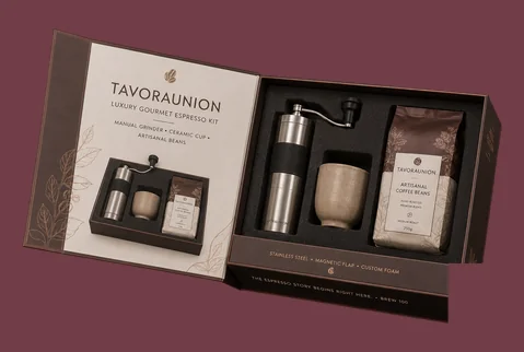
➜
Magnetic Rigid Kit Boxes
Rigid greyboard, a hinged magnetic closure and fitted inserts can give higher-value programs or recurring wellness kits a substantial feel and an orderly product reveal.
- Premium multi-product programs
- Magnetic hinged closure
- Foam or board inserts
- Subscription and welcome kits
This route supports a substantial presentation and repeated access where the approved rigid structure is designed for it.
Customize Now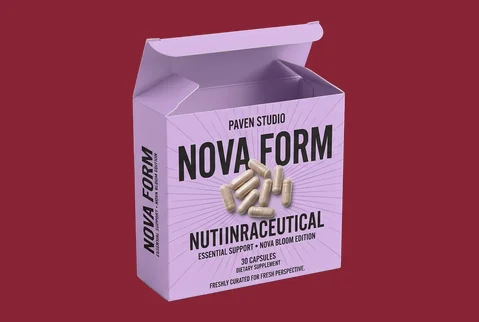
➜
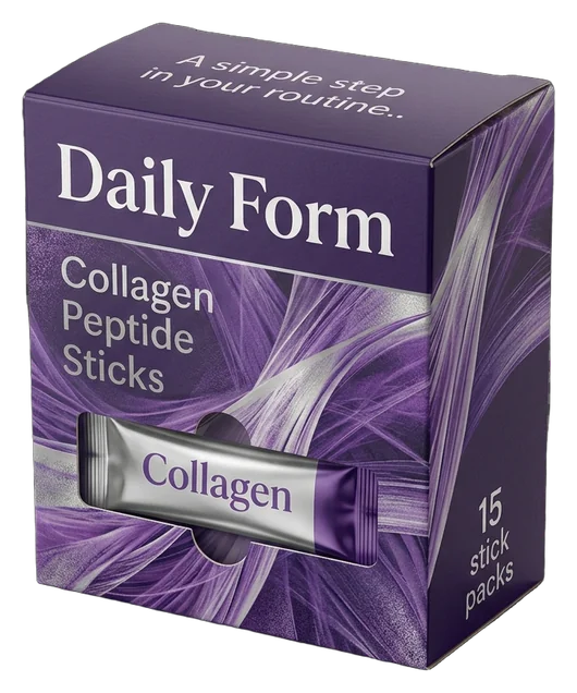
Sachet and Blister Cartons
Cartons for sachets or blister-packed products can organize multiple daily-use units while giving the brand room to explain the program and distinguish variants clearly.
- Daily-use pack arrangements
- Divider or tray options
- Clear program navigation
- Retail and routine discovery
The customer sees a planned routine rather than a loose collection of individual units.
Customize Now
➜
Branded Subscription Mailers
A corrugated mailer can carry the visual identity through delivery while holding bottles, jars, sachets or printed guidance in a planned subscription arrangement.
- Recurring delivery configurations
- Corrugated mailer structure
- Inside and outside printing
- Guided first-opening sequence
It turns receipt and opening into a connected brand moment without positioning the box as a commodity shipping carton.
Customize NowMATERIALS THAT SET THE TONE
Give the Formula a Physical Character Customers Can Feel
The material establishes whether a nutraceutical box feels clean and precise, natural and grounded, substantial and gift-worthy, or ready for a branded delivery experience. That impression begins before customers study the printed details. Smooth paperboard can give fine typography and structured range systems greater clarity, while kraft can support an earth-led or ingredient-conscious identity. Rigid greyboard can give programs and kits greater physical presence, and corrugated material can continue the same brand character into subscription or direct-delivery formats. Select the board by the experience the product should create, not by thickness alone.
SBS Paperboard for Clean Definition

SBS paperboard gives detailed typography, controlled colors and organized information panels a clean visual foundation. It is well suited to bottle cartons, jar boxes, sachet packs and retail ranges where customers must quickly distinguish one formula from another. A smooth surface also supports a consistent parent-brand system across several SKUs. Bright color, restrained clinical-style layouts or more expressive wellness artwork can all be considered without changing the fundamental structure of the range.

Kraft for a Natural, Grounded Character

Kraft can support nutraceutical brands built around botanical ingredients, simplified formulations or a more craft-led market position. Its natural surface gives the package an immediate material character instead of relying on printed graphics to create the entire impression. White ink, dark typography or selective color can help the brand and formula name remain clear against the kraft surface. The design should use the material deliberately rather than covering it so heavily that its natural character disappears.
Rigid Greyboard for Programs and Kits

Rigid greyboard gives curated programs, influencer kits, practitioner presentation sets and multi-product routines greater physical presence. The substantial construction can make the set feel planned as one complete brand experience rather than assembled from unrelated products. Wrapped surfaces, magnetic closures, lift-off lids and fitted inserts can be selected according to the program. The value comes from the relationship between the structure, the arrangement and the intended opening—not from thickness alone.
Corrugated Board for Branded Delivery

Corrugated material is relevant when the package must carry the brand through a subscription receipt, launch kit or direct-to-customer delivery. Printing can keep the mailer connected to the retail range, while inserts or dividers can organize the contents inside. The format should be planned as a branded product mailer or presentation box rather than a large commodity shipping carton. This keeps the structure aligned with the product experience and the production capabilities suited to customized work.
MAKE THE RANGE EASY TO READ
Build Recognition Across Every Formula and Format
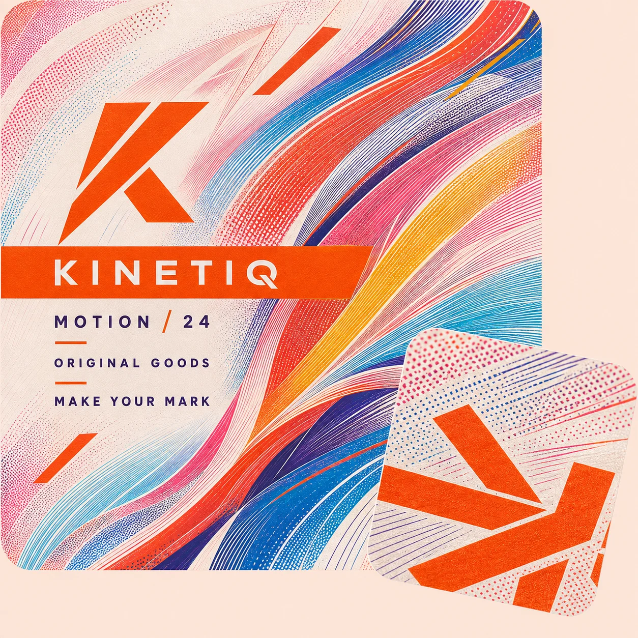
Customers may meet a nutraceutical range through a shelf, practitioner recommendation, subscription box or product page. Printing should help them recognize the parent brand, distinguish formulas and find the information they need without making the pack feel crowded. Use CMYK, PMS color or white ink on kraft to create a consistent family system, then adapt formula names, product categories, variant colors and buyer-supplied information panels for each SKU. Outside and inside printing can connect the first view with the opening sequence, so the range feels planned across retail, delivery and kit presentation.
- Separate formulas without losing the brand
- Clarify daily-use cues at a glance
- Keep parent identity across every SKU
- Reserve space for important information
- Continue the brand inside the box
- Stay recognizable across selected channels
SURFACES THAT GUIDE ATTENTION
Decide What Customers Notice Before They Read Further
A nutraceutical box can contain accurate information and still feel difficult to understand when every panel, color and finish competes for attention. Finishes should help establish the overall quality level, direct the eye toward the brand or formula name and give selected programs a distinct place within the range. Matte, gloss, soft-touch, foil, embossing, debossing and raised effects should be chosen according to the intended impression. The goal is not to decorate every surface. It is to make the most important part of the package easier to notice and the product more coherent in the hand.
-
 Establish the Overall Quality Level
Matte or soft-touch lamination can give wellness-led, practitioner-facing or premium daily-use ranges a calmer and more considered surface. Gloss can support stronger color and sharper contrast when the brand identity is energetic, performance-led or visually bold. The best treatment depends on the artwork and how the package will be handled or photographed. A finish should strengthen the selected brand character rather than force every nutraceutical product into the same visual style.
-
Give the Brand and Formula Clear Priority
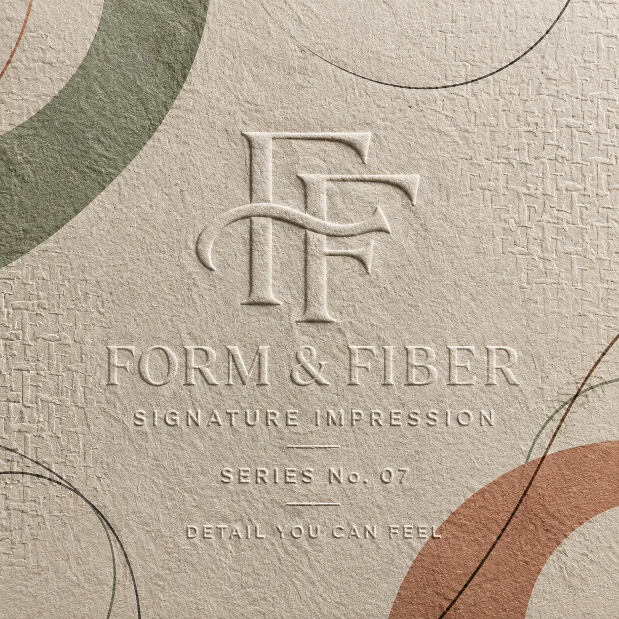
Foil stamping, embossing, debossing, spot UV or raised effects can give selected elements greater visual and tactile weight. The logo, formula name or important range marker may receive emphasis while supporting details remain quieter. This creates a clearer order of attention. Customers can recognize the brand first, understand which product they are viewing and then move naturally toward the supporting information.
-
Distinguish Programs and Special Ranges
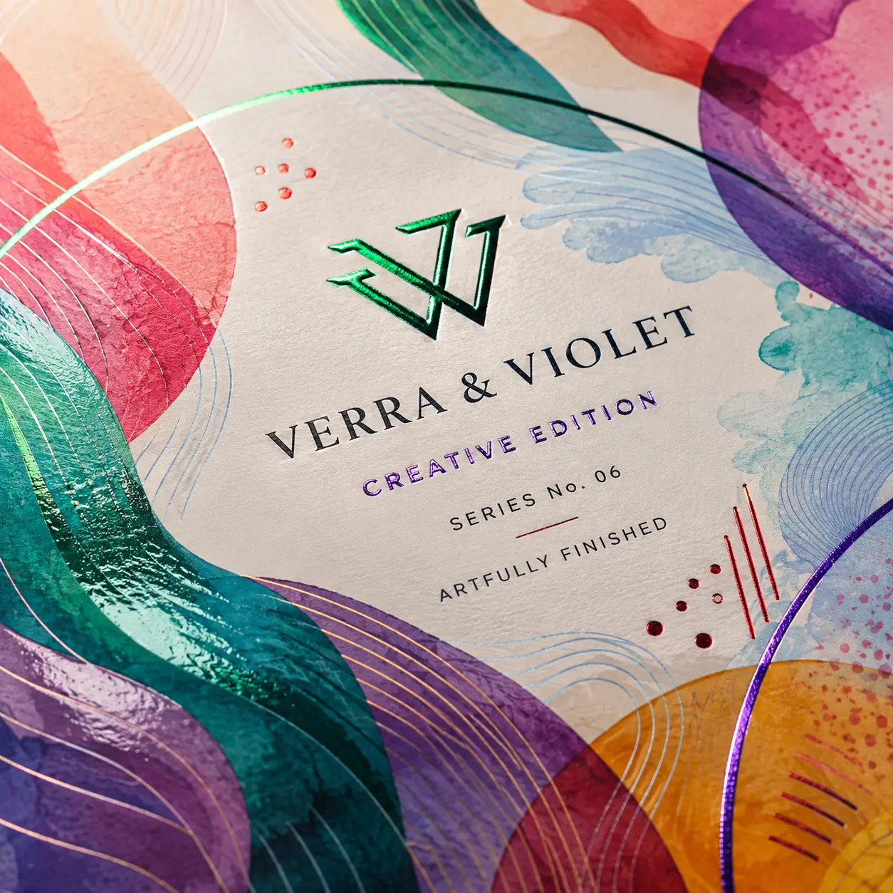
Selective surface contrast can help a starter program, limited collection, practitioner kit or higher-value formula feel distinct from the core range. Gold, silver, rose gold, colored foil or raised effects may be used when they fit the brand system. The special edition should still look related to the parent brand. Finishes work best when they create a meaningful difference without breaking the visual continuity customers already recognize.


CONTINUE THE EXPERIENCE INSIDE
Turn Opening Into a Clear Introduction to the Routine
The exterior may create the first expectation, but the interior determines whether that expectation continues when the package opens. For starter programs, subscription sets, practitioner kits and multi-formula collections, customers should be able to understand what they received and how the products relate. Printed internal surfaces can continue the visual identity, while inserts, dividers and considered spacing can give every bottle, jar, sachet or accessory a deliberate place. The outcome is more than an organized box. It is a guided introduction that helps the customer move from the brand promise to the individual products without the experience becoming loose, crowded or visually disconnected.
-
Carry the Wellness Story Inward
Use relevant colors, patterns or short approved messaging inside the lid, tray or mailer so the brand does not disappear when the outer package opens. The interior can reinforce the product category, routine or program without simply repeating the front panel. This continuity is especially useful for subscription programs and presentation kits, where the customer spends more time with the inside of the package than with a standard retail carton.
-
Make the Routine Easier to Understand
Use foam, paperboard, kraft or corrugated inserts and dividers to separate products according to the intended program. Bottles, sachets, printed guidance or related components can be arranged so customers can distinguish them without searching through a loose pack. The insert should be planned around the actual dimensions, product count and removal needs. Its purpose is to make the relationship between the products clearer while supporting a composed presentation.
-
Shape a Clean First Reveal
Control what becomes visible first when the lid lifts, tray slides or mailer opens. A hero product may lead the sequence, or a complete program may be presented together when understanding the full routine matters more. The first reveal should support the reason the customer selected the product. For a launch kit it may create focused anticipation; for a subscription it may confirm brand continuity; and for a practitioner set it may make the contents easier to introduce.


EXPERT-GUIDED NUTRACEUTICAL PACKAGING
Nutraceutical Box Customization Made Easy & Fast — Built to Fit, Label & Present
Our nutraceutical packaging experts, structural designers, print specialists, consultants, and project managers make custom nutraceutical box ordering easy and fast by bringing your supplied supplement bottle, capsule carton, tablet pack, powder sachet, stick pack, pouch, blister card, sample pack, wellness kit, product count, selected box style, artwork, Supplement Facts copy supplied by the brand, directions, warning copy, ingredient details, flavor or formula variant, and health-product brand direction into one production-ready package. We guide internal sizing, bottle or pouch clearance, insert support, divider spacing, board thickness, coating and finish compatibility, retail display or mailer needs, logo placement, Supplement Facts, directions, warning, barcode, QR, batch, lot, expiry, serving-size, count, flavor, formula, and variant-panel spacing where required, dieline alignment, bleed, safe zones, cost calculation, timeline planning, prepress setup, and 3D proof review. The result is a custom nutraceutical box that fits the supplied product format, supports clearer labeling, presents wellness branding professionally, and moves to production with fewer sizing, print, structure, or approval risks.

-
Fast
Specs-to-Quote Alignment
Experts align nutraceutical format, product count, selected box style, board thickness, insert needs, label panels, artwork, cost, timeline, prepress setup, and 3D proof early — helping reduce quote delays and approval back-and-forth.
-
Exact
Bottle, Pouch & Insert-Fit Review
We check bottle height, carton depth, pouch stack, sachet count, blister-card size, stick-pack layout, insert cavity, divider spacing, sleeve tolerance, and closure behavior so nutraceutical boxes support better retail, kit, sample, or shipping handling.
-
Label-Ready
Supplement Panel & Warning Check
Print specialists review dieline alignment, Supplement Facts space supplied by the brand, ingredient panels, directions, warning-panel space where required, barcode or QR placement, batch and expiry-code areas, small-text readability, coating compatibility, and finish-mask setup so nutraceutical packaging prints more cleanly.
Prepare a Nutraceutical Box That Works Beyond the Mockup
A strong design concept still needs accurate sizing, a suitable structure, organized information and an approved production file. The following process helps connect the intended brand experience with the practical decisions required to manufacture the box.
-
Plan the Box Around the Actual Product
Start with the product that will go inside rather than choosing a stock-looking box and forcing the contents to fit. Supply the length, width and height of the bottle, jar, blister pack, sachet group or inner container. Include the cap, lid, dispenser or any part that changes the usable space. Also confirm the pack count, intended arrangement, wrapping, literature and whether an insert is required. Irregular product shapes and multi-item sets may need additional planning for spacing and removal. Exact internal clearances should be determined through the dieline and structure-development process rather than estimated in page copy. This approach helps keep the final package proportionate to the product and gives the artwork team the correct panel space from the beginning.
-
Organize the Brand and Information Hierarchy
Decide what customers should understand first. The parent brand, formula name, product category and variant distinction should not compete equally with every supporting statement. Establish a front-panel hierarchy, then plan the side and back panels around the information supplied by the buyer. The same system can be adapted across several formulas by retaining common typography, brand placement and layout logic while changing controlled elements such as the product name, variant color or category cue. This makes the range easier to navigate without making every SKU look identical. Space can be prepared for ingredient, direction, warning, barcode or other information panels supplied by the buyer. Responsibility for determining and approving legally required, regulated or product-specific content remains with the brand.
-
Prepare Artwork on the Final Dieline
Artwork and dieline support are available before production. AI, PDF, PSD and EPS files can be accepted for review, and assistance may include resizing, bleed preparation, safe-zone checks and adapting artwork to the approved dimensions. Design files should be prepared on the final structure rather than transferred from an unrelated carton. Panel direction, tuck areas, folds, glue zones and inside-print surfaces can affect how the artwork reads after assembly. A digital proof is provided for every approved order. Review spelling, formula names, variant colors, panel order, barcodes and all buyer-supplied information carefully. Printing moves forward only after the required payment, artwork approval and structure confirmation.
-
Match the Quantity to the Launch Stage
Supported paperboard, cardstock, kraft and corrugated formats may start from 50 boxes. Supported rigid-box formats may start from 25 boxes, including relevant rigid structures with inserts or magnetic closures. Starting with a lower quantity does not automatically remove meaningful customization. Custom sizing, materials, exterior or interior printing, finishes and inserts remain available where they suit the approved structure and production specification. Per-unit pricing generally improves as the order quantity increases. More visible price movement may begin around 500 units, but the final difference depends on the structure, material, artwork, finishes, number of designs and production setup. Design firms and white-label packaging partners may also discuss coordinated programs or multi-address shipping requirements.
-
Plan Proofing, Production and Shipping Separately
Production normally takes 4–6 business days after payment, final artwork approval and structure confirmation. Production-ready jobs are generally planned to print and ship within 7 business days. Shipping transit time is separate, while complex multi-design orders may require a separately confirmed schedule. Orders containing many low-quantity designs, advanced finishes, rigid construction or corrugated components may require additional coordination. Any schedule that differs from the normal plan should be confirmed before production begins. A physical prototype may be available for a qualifying bulk or wholesale project. Where approved, its cost may be adjusted into the resulting order. This is separate from the digital proof and should not be understood as an unrestricted free-sample service. Careful preparation before production protects the most important part of the project: a finished nutraceutical box that reflects the approved structure, artwork and intended customer experience rather than only resembling the original screen design.

NUTRACEUTICAL BOX HELP
Answers Before You Size, Brand and Order
Yes. The box can be planned around your bottle, jar, blister pack, sachets or grouped product configuration instead of forcing the product into a generic size. Provide the product’s length, width and height, including the cap, lid or dispenser. Also confirm the pack count, arrangement, literature and whether an insert is required. The dieline can then be developed around the approved product and structure. Exact internal spacing and removal clearance are confirmed during structure planning rather than guessed in advance.
Yes. A coordinated packaging system can keep the parent brand recognizable while giving each formula or product type its own clear identity. Shared elements may include logo placement, typography, panel structure, finish strategy and information hierarchy. Controlled elements such as formula names, variant colors or product-category cues can then change between SKUs. This creates a connected range without making customers study every panel to understand which product they are viewing. The final system can be adapted for retail cartons, kits or relevant subscription formats.
Yes. Inside printing and fitted inserts can be included where they suit the selected structure and product arrangement. The interior may continue colors, artwork or short approved messaging from the exterior. Foam, paperboard, kraft, cardboard or corrugated inserts can be die-cut around bottles, jars, sachets and related components. The insert design depends on the product dimensions, pack count, intended order and removal needs. This is especially useful for starter programs, multi-product kits, practitioner presentations and subscription boxes.
Sleeve-and-tray, two-piece and rigid-box formats provide the strongest routes when the order of reveal and product arrangement matter. A sliding tray can introduce a compact program in stages, while a separate lid and base can present a complete set together. Magnetic rigid boxes can support repeated access where the approved structure is designed for it. A branded corrugated mailer may be more suitable for subscriptions. The best option depends on the product count, channel, budget and how the customer should discover the contents.
Yes. A smaller nutraceutical brand can begin with packaging designed around its own product and visual identity without committing to an unnecessarily large first run. Supported paperboard, cardstock, kraft and corrugated boxes may start from 50 units. Supported rigid formats may start from 25 units. Relevant custom sizing, exterior or interior printing, material choices, finishes and inserts remain available where they fit the approved structure and production specification. This gives growing brands room to test a launch or introduce a focused range without relying on generic stock packaging.
AI, PDF, PSD and EPS files can be submitted for artwork review and production preparation. Support may include a dieline or template, resizing, bleed and safe-zone assistance, and checking how the design fits the approved structure. The artwork should include all formula names, panel content and buyer-supplied information in its intended final form. A digital proof is supplied before production, giving you an opportunity to review panel order, text, colors and placement before approval.
Production normally takes 4–6 business days after payment, final artwork approval and structure confirmation. Production-ready jobs are generally planned to print and ship within 7 business days. Shipping transit time is separate. Complex multi-design programs, rigid construction, corrugated work or jobs with several production setups may need a separately confirmed schedule. The production clock does not begin while artwork, payment or structural details remain unresolved. Any different schedule should be communicated and agreed before the job moves forward.
No. The box should not be described as FDA approved, medical grade or sterile unless separate verified certification specifically supports that claim. The packaging can include panels for ingredient information, directions, warnings, barcodes and other content supplied by the buyer. Tamper-evident structural features may also be discussed where relevant. However, the brand remains responsible for determining, supplying and approving its legally required or regulated information. Packaging design and printing support do not replace product-specific legal or regulatory review. The badge icon references are descriptive placeholders until the approved backend icon IDs are mapped.
CUSTOMER SUCCESS STORIES
Hear What Our Customers Say

As a small business, finding premium finishes in lower quantities was always difficult. Global Custom Packaging gave us the freedom to customize our boxes and create the distinctive, polished look we wanted without committing to a large order. We still work with them today and have expanded into multiple product variants, each with the same impressive presentation.
Jordan Blake
We sell online and in stores while regularly promoting at major events, running influencer campaigns, and launching seasonal collections. Thunder Packaging has become our dependable source for everything—from premium mailer and product boxes to sturdy influencer kits, rigid packaging, kraft boxes, and limited-edition Christmas designs. Whatever structure, material, or branded look we need, we no longer have to go anywhere else.
Avery Quinn

I never worry about how my packaging will look or whether my artwork contains typos, incorrect bleed areas, or other design errors. Their 3D previews and helpful design support give me confidence before printing. If the team notices a problem, they contact me, correct it quickly, and never charge extra for the assistance.
Cameron Reese
I’m really impressed with Global Custom Packaging’s precise, richly saturated printing and the accuracy of their die-cutting. The boxes were produced in exactly the right size, with a clean, well-formed structure and no fitting or construction issues. The finished packaging looked polished, consistent, and ready to represent our products professionally.
Morgan Taylor
I received my quote within a few hours, and once we agreed on the price, the designer responded quickly, completed the required changes, and prepared my artwork for printing. The 3D proof arrived promptly, allowing me to review everything and place my order that same day. My packaging was delivered on time, exactly as Global Custom Packaging had committed.
Harper Lane