

-

Low Starting Quantity
-

Digital Proof Included
-

Design Support Available
-
In-House Production
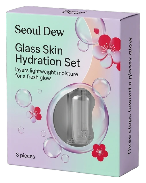
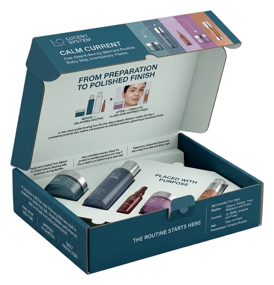
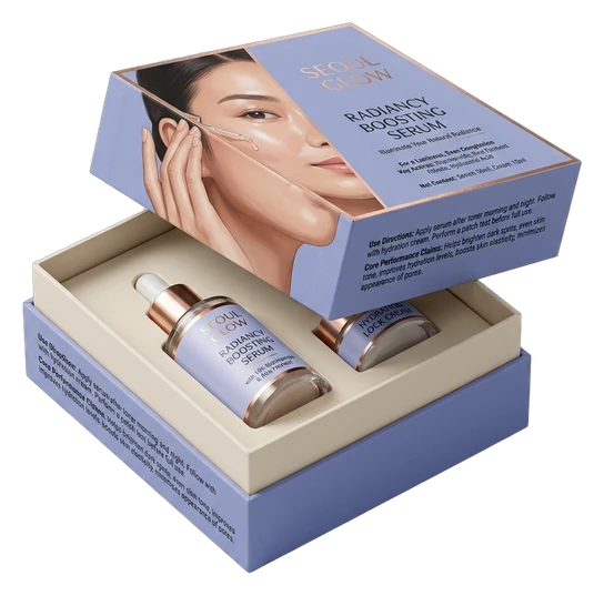
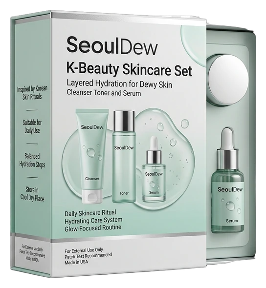
Create a skincare box that makes your formulas feel considered, your collection easy to recognize, and your K-beauty brand polished from first glance through product reveal. K-beauty customers often compare several serums, creams, masks, and routine sets within moments. Custom packaging can turn that crowded choice into a clearer brand encounter through coordinated color, disciplined typography, precise sizing, and a box structure that suits the product inside. The result is a collection that feels intentional across retail displays, online product photography, gifting, subscription delivery, or PR presentation while helping each formula remain easy to identify. We shape each box around your containers, range architecture, selling channel, and intended brand character. Whether you need a clean folding carton, a coordinated routine set, or a rigid presentation box, our team helps translate the brief into a practical structure and a consistent visual system. That service is supported by custom sizing, paperboard, kraft, rigid greyboard, and selected corrugated formats; exterior and interior printing; color matching; finishes; windows; inserts; and artwork or dieline assistance. You can review a digital proof before production, refine the hierarchy across panels, and plan the order around the exact products, quantities, and presentation moments that matter to your launch or established range.

Get Custom Quote
STRUCTURES FOR EVERY ROUTINE
Choose a Box That Fits the Product and Brand Story
K-beauty packaging has to do more than hold a single item. The right format should suit the container, make the routine easy to understand, and express the same brand character across shelves, product photography, gifting, delivery, or PR outreach. A slim serum carton needs a different fit and opening rhythm from a seven-step set, while a subscription or influencer kit may need stronger arrangement and a more deliberate reveal. Choose the structural route by how the products are grouped, protected, compared, carried, and opened—not by appearance alone.
➜
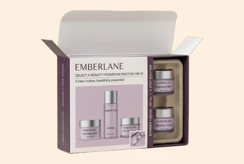
Slim Folding Cartons
Built for individual serums, ampoules, eye creams, and slim bottles, these cartons keep the pack compact while giving front, side, and back panels clear brand and product roles.
- Sized around the primary container
- Tuck-end access with clean fit
- Coordinated color and typography
- Suited to retail and e-commerce
A focused format that helps each formula read clearly while keeping the wider collection visibly connected.
Customize Now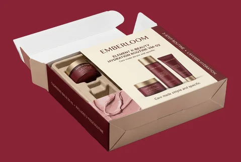
➜
Auto-Bottom Product Boxes
A stronger base supports heavier jars, creams, cleansing balms, and bottled skincare without turning the box into an oversized structure. The larger panel area also gives product benefits and brand cues room to breathe.
- Support for heavier containers
- Secure base with efficient setup
- Room for disciplined panel design
- Useful for shelf-based skincare
This route combines a more confident physical stance with organized information and a composed shelf appearance.
Customize Now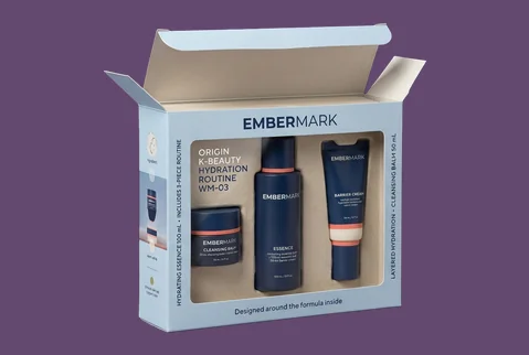
➜
Window Skincare Cartons
A die-cut window can introduce the actual container, shade, or label while the surrounding carton controls the brand story. The window shape and placement should support recognition rather than compete with the artwork.
- Custom window shape and placement
- Container visibility with carton support
- Brand graphics around the reveal
- Useful for retail comparison
Customers see the product without losing the visual structure that makes the range feel deliberate and recognizable.
Customize Now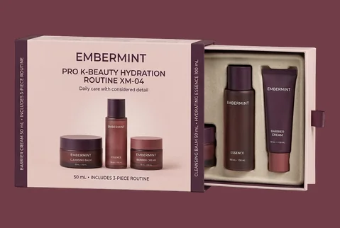
➜
Sleeve and Tray Sets
A sliding sleeve and tray creates a paced reveal for paired products, trial routines, or limited collections. It also divides the brand message between an outer introduction and a more detailed inner presentation.
- Outer sleeve for range identity
- Inner tray for stable arrangement
- Printing across visible surfaces
- Suited to gifting and launches
The layered format gives compact skincare sets a more considered introduction without relying on excessive decoration.
Customize Now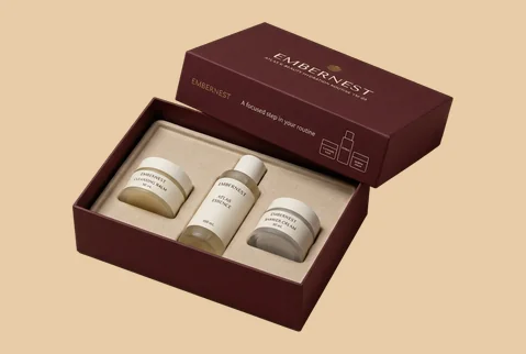
➜
Two-Piece Routine Boxes
A separate lid and base gives multi-product routines, mask collections, and discovery sets a clear presentation frame. Inserts or dividers can organize different steps while keeping the full assortment easy to understand.
- Space for coordinated product groups
- Insert-led routine organization
- Broad lid for visual storytelling
- Made for sets and samplers
A structured overview helps customers understand the collection before choosing or lifting the first product.
Customize Now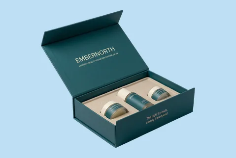
➜
Magnetic Rigid Gift Boxes
Rigid greyboard and a magnetic closure give skincare gifting, flagship routines, and brand collaborations greater physical presence. The structure can support wrapped surfaces, fitted inserts, and a controlled first reveal.
- Substantial rigid-board construction
- Magnetic closure with clean access
- Custom wraps and fitted inserts
- Strong for gifting and PR
Use this format when the box itself must communicate the care, status, and completeness of the skincare set.
Customize Now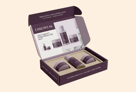
➜
Branded Skincare Mailers
Corrugated mailer formats carry the brand into subscription delivery, e-commerce sets, and promotional shipments. Exterior and interior printing can connect the arrival experience with the identity already used across product cartons.
- Corrugated structure for grouped products
- Insert options for stable placement
- Branding outside and inside
- Relevant to delivery and subscriptions
The mailer becomes a connected brand touchpoint rather than a visually separate outer shipping experience.
Customize Now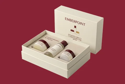
➜
PR and Influencer Kits
Designed around the story a recipient should understand first, these kits can organize hero products, routine steps, campaign messaging, and launch details within one coordinated presentation format.
- Campaign-led product arrangement
- Custom compartments and lift points
- Layered exterior and interior messaging
- Built for launches and handoffs
A guided layout helps the recipient read the campaign, identify the products, and move through the kit naturally.
Customize NowMATERIALS THAT SET THE TONE
Give the Skincare Range the Right Physical Character
The board changes how a K-beauty box feels before a customer studies its claims or opens the pack. Smooth paperboard can give pale gradients, fine type, and precise product coding a cleaner foundation. Kraft can support an ingredient-led or craft-aware identity, while rigid greyboard gives curated routines and gifting sets more physical presence. Corrugated material can extend the same visual language into mailers, subscriptions, and campaign kits. Our team helps compare these options by container weight, box style, print plan, handling needs, and the impression the range should create.
SBS Paperboard for Clean Definition

Smooth SBS paperboard gives detailed illustrations, fine typography, soft gradients, and controlled skincare color systems a clear printing surface. It suits individual cartons and coordinated product families that need to look precise without feeling overly heavy. Choose it when clean graphic definition, accurate variant coding, or a polished retail appearance is more important than a visibly natural board character.

Kraft for a Natural Brand Direction

Kraft gives the package a warmer, more tactile starting point. It can suit botanical, ingredient-focused, handmade, minimalist, or craft-led skincare identities when that material character genuinely matches the formula and brand position. White ink, selective color, and disciplined typography can keep the design readable while allowing the natural surface to remain part of the visual identity.
Rigid Greyboard for Curated Sets

Rigid greyboard gives flagship routines, gifting collections, collaborations, and PR kits a more substantial feel. Its wrapped construction supports magnetic closures, separate lids, sleeves, fitted inserts, and a wide range of surface treatments. Use rigid material when the customer should experience the set as a complete, carefully arranged skincare collection rather than a group of individual products placed together.
Corrugated Board for Branded Arrival

Corrugated material works well for e-commerce skincare sets, subscription programs, promotional kits, and influencer mailers where the outer structure must manage grouped products and still carry a clear brand identity. Exterior and interior printing can connect the delivery box with the visual language of the primary cartons. Inserts or dividers can then help maintain a deliberate arrangement through handling and opening.
MAKE THE ROUTINE EASY TO RECOGNIZE
Build One Clear Identity Across Every Skincare Step
K-beauty ranges often ask customers to compare formula type, skin concern, routine step, texture, and product size in a small visual space. Printing should turn that complexity into an identity customers can read quickly. Use color to distinguish cleansers, toners, essences, serums, masks, and creams while keeping the parent brand consistent across every SKU. CMYK, spot colors, white ink on kraft, metallic ink, and inside printing provide production routes; the service goal is a collection that feels connected in retail, photography, gifting, delivery, and launch content.
- Give each routine step a clear visual role
- Keep the parent brand consistent across variants
- Make product names easier to compare
- Carry the design beyond the front panel
- Create campaign editions without losing continuity
- Stay recognizable across selected selling channels
SURFACE DETAILS WITH A JOB
Control What Customers Notice and Feel First
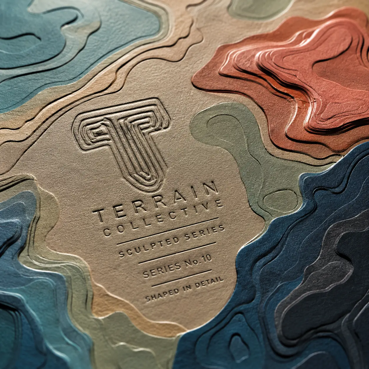
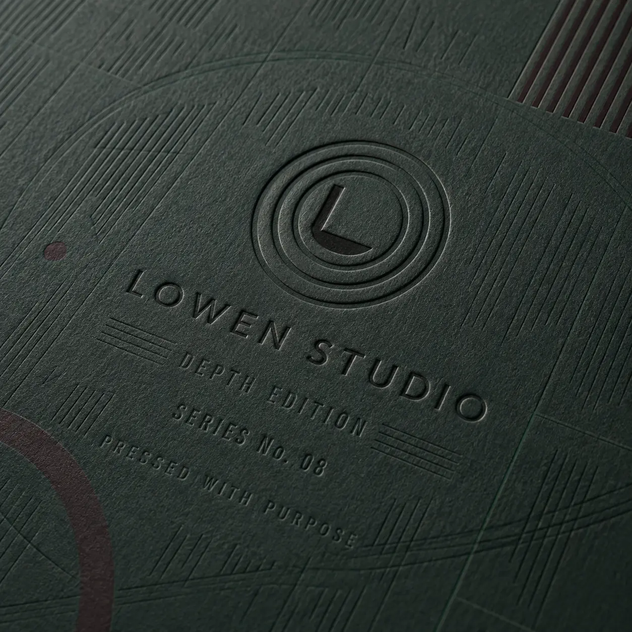
Finishes should make the visual order of a skincare box easier to understand, not simply make every panel busier. A quiet matte or soft-touch surface can support a calm, clinical, or spa-led identity. Gloss and spot UV can sharpen selected color, texture, or water-inspired details. Foil, embossing, debossing, and raised effects can give the brand mark, product name, or limited-edition cue more weight. We help choose finishes by the message that should lead and the way the box will be viewed and handled.
-
 Establish the Overall Brand Mood
Matte lamination can give a skincare range a clean, controlled appearance, while soft-touch treatment can add a smoother hand feel to gifting and flagship collections. Gloss may suit brighter, energetic, or highly color-led identities that need stronger surface clarity. The right choice depends on whether the brand should feel calm, clinical, playful, botanical, fashion-led, or gift-oriented. The finish should reinforce that direction across the collection rather than introduce an unrelated effect.
-
Direct Attention to the Right Detail
Foil, embossing, debossing, raised spot UV, or selective gloss can give chosen information greater visual or tactile weight. The most useful target may be the brand name, formula title, routine step, campaign mark, or a small graphic detail. Our team can help determine where contrast will improve the design hierarchy and where an uncoated or quieter area should remain untouched. Selective use usually creates a clearer result than applying an effect across every available surface.
-
Give Launches and Gift Editions Distinction
Seasonal sets, collaborations, holiday routines, and limited releases may need to feel different from the core range while remaining visibly related to it. A new foil shade, controlled surface contrast, or embossed campaign detail can mark the occasion without replacing the established brand system. This approach allows special editions to earn attention while still looking like part of the same K-beauty family.


CONTINUE THE ROUTINE INSIDE
Make Every Skincare Set Clear From Opening to Selection
A polished exterior creates an expectation, but the inside determines whether a routine set feels clear or confusing when it opens. K-beauty collections may include several steps, similar containers, sample sizes, or paired formulas, so arrangement matters. Printed interior surfaces can continue the brand mood, while inserts, dividers, and planned spacing can make each product easier to identify and remove. The aim is not a theatrical reveal for every order. It is a purposeful introduction that helps gift, sampler, subscription, PR, and multi-product formats feel organized and complete.
-
Keep the Brand Present After Opening
Carry relevant colors, patterns, campaign graphics, or short messages onto the inside lid, base, sleeve, or tray. This keeps the identity active after the exterior panels are no longer the main point of view. Interior printing can also introduce the routine, welcome the recipient, or connect the set with a campaign theme. The message should remain brief enough to support the products rather than compete with them.
-
Make the Routine Easy to Follow
Use printed step numbers, dividers, labeled compartments, or a planned left-to-right sequence to clarify how products relate. A toner, essence, serum, eye treatment, and moisturizer should not feel like unrelated items simply because they share one box. Foam, paperboard, kraft, corrugated, or cardstock inserts can be shaped around the selected containers. The arrangement can account for different heights, caps, jars, bottles, tubes, and sample formats while keeping removal practical.
-
Shape a Considered First Reveal
Decide which product, message, or campaign element should become visible first. A hero serum may lead the set, while supporting products appear in routine order. A gift collection may open to a balanced overview, while a PR kit may introduce the campaign before the individual formulas. A well-planned reveal helps the recipient understand what has arrived and how to explore it without adding unnecessary layers or decoration.


EXPERT-GUIDED K-BEAUTY PACKAGING
K-Beauty Skincare Box Customization Made Easy & Fast — Built to Fit, Protect & Present
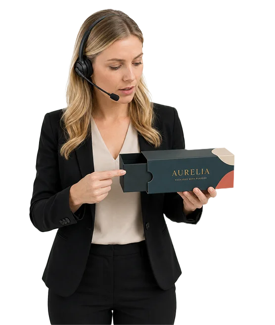
Our K-beauty skincare packaging experts, structural designers, print specialists, consultants, and project managers make custom K-beauty skincare box ordering easy and fast by bringing your serum, essence, toner, ampoule, cream, cleanser, mask, sunscreen, mist, balm, patch, sample, or routine-kit dimensions, container weight, pack count, selected box style, inserts, artwork, and brand direction into one production-ready structure. We guide bottle, jar, tube, dropper, pump, pouch, and sheet-mask fit, cap clearance, insert tolerance, routine-set layout, stock thickness, coating and finish compatibility, bilingual label-panel spacing, ingredient, usage, barcode, QR, shade or formula variant areas, warning-panel space where required, dieline alignment, bleed and safe-zone setup, cost calculation, timeline planning, prepress preparation, and 3D proof review. The result is a custom K-beauty skincare box that fits the product, supports better handling, presents routine details clearly, and moves to production with fewer sizing, print, structure, or approval risks.
-
Fast
Routine Specs-to-Quote Alignment
Experts align container size, product count, selected box style, insert needs, stock thickness, bilingual artwork, formula variants, finish effects, cost, timeline, prepress setup, and 3D proof early — helping reduce quote delays and approval back-and-forth.
-
Exact
Bottle, Jar, Tube & Ampoule Fit Review
We check bottle height, jar diameter, tube length, dropper cap depth, pump clearance, ampoule vial spacing, pouch size, mask pack count, insert tolerance, and closure behavior so the box fits properly.
-
Print-Ready
Ingredient, Routine & Finish Check
Print specialists review ingredient panels, usage steps, routine order, bilingual or multilingual copy areas, barcode or QR spacing, formula variants, warning-panel space where required, dieline alignment, coating compatibility, foil, spot UV, embossing, and finish-mask setup so your skincare artwork prints more cleanly.
Prepare a K-Beauty Packaging Order That Works in Production
Good skincare packaging starts with a clear product and brand brief. Our team can help turn container information, SKU plans, artwork, selling channels, and quantity requirements into a structure that is practical to manufacture and consistent with the intended presentation. The following decisions should be settled before production so the finished boxes fit correctly, communicate clearly, and arrive according to an agreed plan.
-
Measure the Complete Pack, Not Just the Container
Box sizing should reflect the product exactly as it will be packed. Measure the container’s length, width, and height, including caps, pumps, droppers, lids, wrapping, or any raised components. For irregular bottles or jars, provide reference photographs or a physical product where appropriate. For a routine set, confirm the number of products, their preferred arrangement, and whether an insert, divider, tray, booklet, applicator, or promotional item will be included. Removal clearance also matters. A very tight compartment may look precise but make the product difficult to lift. We do not assign generic dimensions based only on terms such as “serum box” or “skincare set.” The final size should follow the actual containers and packing plan.
-
Match the Structure to the Selling Channel
An individual retail carton, e-commerce mailer, subscription set, gift box, and PR kit face different presentation and handling needs. Retail formats may prioritize panel visibility and compact shelf use. Gift sets may need a wider overview and a more substantial opening. Mailers may require corrugated construction and a stable internal arrangement. Tell us where the packaging will be seen, handed over, photographed, delivered, or opened. One primary channel and the most relevant supporting channels are usually enough to guide the structural decision without trying to make one box perform every possible role.
-
Organize the Range Before Finalizing Artwork
A multi-SKU K-beauty range needs a repeatable visual system. Decide which elements remain fixed across every product and which elements change by formula, routine step, ingredient story, skin concern, size, or campaign. The brand mark, typography, panel structure, and information order may stay consistent, while color, illustration, product name, or step number provides distinction. This planning helps prevent later SKUs from looking disconnected or forcing essential information into spaces that were not designed for it. For multi-design orders, provide a clear list of SKUs and identify which artwork belongs to each structure and quantity.
-
Prepare the Dieline and Production Files
Artwork should be created on the approved dieline for the confirmed box dimensions and structure. AI, PDF, PSD, and EPS files are accepted production formats. Our artwork support can help with templates, resizing, bleed, safe zones, panel alignment, and basic production checks. Keep small text, ingredient information, directions, warnings, barcodes, and required product details readable and inside the safe area. The buyer remains responsible for confirming the accuracy and legal suitability of supplied cosmetic, ingredient, marketing, or regulatory content. Inside printing, windows, foil, embossing, spot UV, and other special treatments should be identified clearly in the artwork or finishing instructions.
-
Review the Digital Proof Carefully
A digital proof is available for every approved order. Use it to confirm the artwork version, spelling, color references, panel order, orientation, dieline placement, and indicated finishing areas before production begins. A digital proof represents the approved production layout; it is not a physical prototype. A physical prototype may be available for a qualifying bulk or wholesale project, and its cost may be adjusted into the resulting order where approved. Printing does not begin until the required payment, artwork approval, and structural confirmation are complete.
-
Plan Quantity, Production, and Delivery
Paperboard, cardstock, kraft, and supported corrugated K-beauty boxes may start from 50 units. Supported rigid-box formats may start from 25 units. Relevant custom sizing, printing, materials, finishes, and inserts can remain available at these starting quantities when they suit the chosen structure and production specification. Per-unit pricing generally improves as quantity increases, with more visible differences often appearing around 500 units. The exact price depends on size, material, structure, artwork, printing, finishes, inserts, quantity, and delivery requirements. Production normally takes 4–6 business days after payment, final artwork approval and structure confirmation. Production-ready jobs are generally planned to print and ship within 7 business days. Shipping transit time is separate, while complex multi-design orders may require a separately confirmed schedule. Orders can also be planned for bulk quantities, multiple designs, selected multi-address deliveries, design firms, or white-label packaging programs. Confirm these requirements during quoting so production and shipping can be scheduled correctly.

K-BEAUTY BOX QUESTIONS
Answers Before You Size, Design, and Order
Yes. We can plan one coordinated box around several skincare products when you provide the exact containers, quantities, and preferred arrangement. The sizing process considers the full packed dimensions of each bottle, jar, tube, sachet, applicator, or sample. We also account for inserts, dividers, spacing, product removal, and any printed literature. Different products can sit in separate fitted positions rather than being placed loosely together. A product list, container measurements, and photographs are useful starting points. For irregular components or a complex arrangement, additional references may be requested before the structure is finalized.
Yes. A growing skincare brand can begin with packaging designed around its own products and identity without committing to an unnecessarily large first run. Paperboard, cardstock, kraft, and supported corrugated formats may start from 50 boxes. Supported rigid skincare boxes may start from 25. Relevant custom sizing, exterior or interior printing, material choices, finishes, windows, and inserts remain available where they suit the selected structure and production specification. This gives a smaller brand room to prepare a launch, test a visual system, introduce a gift set, or order packaging for a focused product range without relying on generic stock boxes.
Start with one consistent brand framework, then give each formula a controlled point of difference. The logo position, typography, panel layout, information order, and overall graphic style can remain consistent across cleansers, toners, essences, serums, masks, moisturizers, and treatments. Color, illustration, routine numbering, product names, or ingredient cues can then help customers distinguish individual products. Our team can review the range as a connected system rather than treating every carton as an unrelated design. Providing the full SKU list early helps us identify shared panels, variable elements, and any structures that require separate dielines.
The best format depends on the number of products, container weights, desired reveal, selling channel, and intended gift impression. A sleeve-and-tray box can work well for compact paired products. A two-piece box gives a wider overview of a routine. A magnetic rigid box creates more physical presence for flagship gifting, collaborations, or PR use. A branded corrugated mailer may suit subscription delivery or an e-commerce set. We can compare these routes after reviewing the containers, packing arrangement, quantity, material preference, and how the recipient should encounter the products when the box opens.
Yes. Relevant interior surfaces can carry color, artwork, patterns, product guidance, routine steps, campaign messages, or a short welcome. Inside printing may appear on the lid, base, tray, sleeve, tuck panel, or corrugated mailer interior, depending on the selected structure. Inserts and dividers can also be printed or coordinated with the exterior design. The inside should support the opening experience rather than repeat every exterior detail. We can help decide which message belongs outside, what should appear first after opening, and how the products should be introduced within the available space.
Yes. We can help arrange buyer-supplied product information across the available panels so it remains readable and visually connected to the brand. Side and back panels may be used for ingredients, directions, cautions, routine steps, product size, barcodes, company details, or multilingual copy. The front can then retain a clearer hierarchy for the brand, product name, formula type, and main identification cues. Our artwork support can check placement, safe zones, bleed, and general legibility. The buyer is responsible for confirming that all supplied cosmetic, ingredient, legal, and regulatory information is accurate and appropriate for the intended market.
You receive dieline and artwork support along with a digital proof for every approved order. Our team can provide or adjust the dieline, check basic artwork setup, resize supplied designs for confirmed dimensions, and assist with bleed, safe zones, panel alignment, and production-file preparation. AI, PDF, PSD, and EPS files are accepted. The digital proof should be reviewed for artwork version, spelling, orientation, panel placement, and finishing instructions. Production begins only after payment, final artwork approval, and structural confirmation. A physical prototype may be available for a qualifying bulk or wholesale project under separately approved terms.
Production normally takes 4–6 business days after payment, final artwork approval, and structure confirmation. Production-ready orders are generally planned to print and ship within 7 business days. Shipping transit time is separate and depends on the destination and selected shipping method. A complex order with many low-quantity designs, different structures, extensive finishing setups, or special packing requirements may need a separately confirmed schedule. These details should be shared during quoting so the production plan can be reviewed before the order moves forward.
CUSTOMER SUCCESS STORIES
Hear What Our Customers Say

As a small business, finding premium finishes in lower quantities was always difficult. Global Custom Packaging gave us the freedom to customize our boxes and create the distinctive, polished look we wanted without committing to a large order. We still work with them today and have expanded into multiple product variants, each with the same impressive presentation.
Jordan Blake
We sell online and in stores while regularly promoting at major events, running influencer campaigns, and launching seasonal collections. Thunder Packaging has become our dependable source for everything—from premium mailer and product boxes to sturdy influencer kits, rigid packaging, kraft boxes, and limited-edition Christmas designs. Whatever structure, material, or branded look we need, we no longer have to go anywhere else.
Avery Quinn

I never worry about how my packaging will look or whether my artwork contains typos, incorrect bleed areas, or other design errors. Their 3D previews and helpful design support give me confidence before printing. If the team notices a problem, they contact me, correct it quickly, and never charge extra for the assistance.
Cameron Reese
I’m really impressed with Global Custom Packaging’s precise, richly saturated printing and the accuracy of their die-cutting. The boxes were produced in exactly the right size, with a clean, well-formed structure and no fitting or construction issues. The finished packaging looked polished, consistent, and ready to represent our products professionally.
Morgan Taylor
I received my quote within a few hours, and once we agreed on the price, the designer responded quickly, completed the required changes, and prepared my artwork for printing. The 3D proof arrived promptly, allowing me to review everything and place my order that same day. My packaging was delivered on time, exactly as Global Custom Packaging had committed.
Harper Lane