

-

Low Starting Quantity
-

Digital Proof Included
-

Design Support Available
-
In-House Production
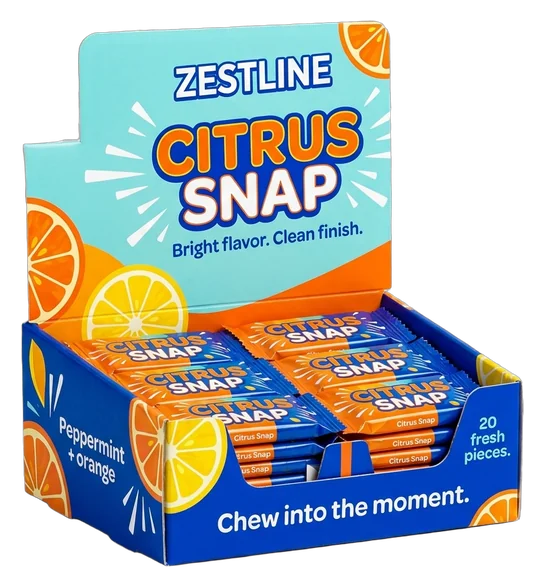
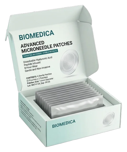
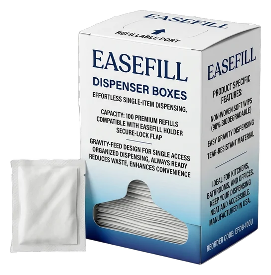
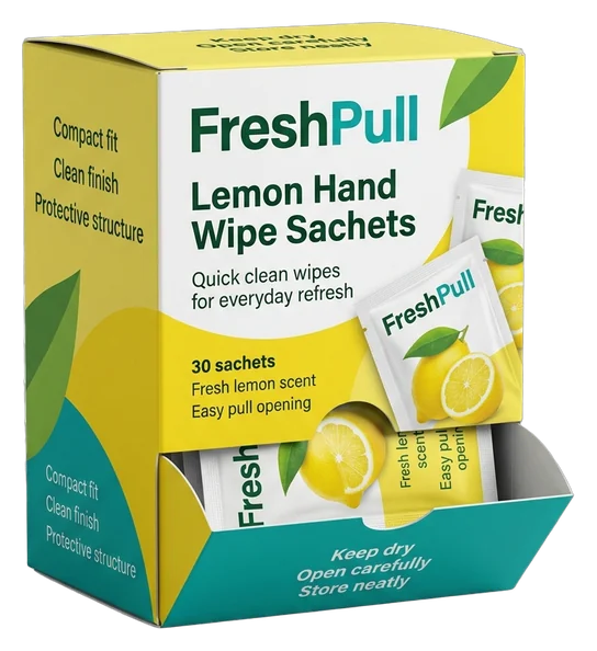
Turn every dispensing point into a clear brand moment with a box that organizes the product, earns shelf attention and makes each item easy to access. Dispenser packaging has only a few seconds to explain what it holds, who it is for and why the product deserves a place on the counter or shelf. We shape the opening, display panel, proportions and printed surfaces around your product, so the box works as both a practical dispenser and a visible brand asset. Customers can recognize the range before they reach for an item, then remove it through an access point designed for a neater, more intentional interaction. Our team helps you turn a loose product, refill, sachet, packet or individually wrapped item into a coordinated dispensing format. We plan the structure around loading, access, display position and brand hierarchy, giving you a box that feels considered at first sight and remains recognizable as stock is used. That result is supported by product-led sizing, custom dielines, paperboard, kraft or suitable corrugated structures, exterior and interior printing, and finishes that direct attention without obstructing the dispensing area. Inserts or dividers can be considered when the product needs control inside the box. Artwork checking, bleed and safe-zone guidance, a digital proof and in-house production help move the idea from first measurements to an approved, production-ready dispenser.

Get Custom Quote
DISPENSING FORMATS
Choose How the Product Is Displayed and Reached
Different dispenser formats change how a product is loaded, presented and removed. A countertop box may need a strong display panel and front access, while a shelf unit may rely on a tear-away section, gravity feed or pop-up opening. The right route depends on product shape, individual wrapping, pack count, refill method, customer reach and the surface that must remain visible after setup. We help compare these practical needs before the structure is finalized, so branding is not sacrificed to the opening and the dispensing action does not feel improvised. Choose a format that keeps the product orderly, makes selection easy and preserves a clear brand presence throughout use.
➜
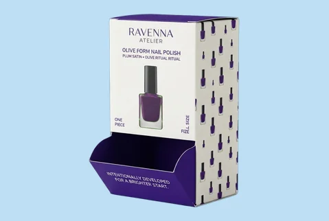
Countertop Dispenser Boxes
Designed for counters, reception areas and point-of-sale displays, this format keeps the product within easy reach while giving the header, front and side panels a clear branding role.
- Front-access dispensing opening
- Product-sized internal space
- Branded header and sidewalls
- Counter and checkout placement
A practical choice when every customer reach should reinforce the product and parent brand.
Customize Now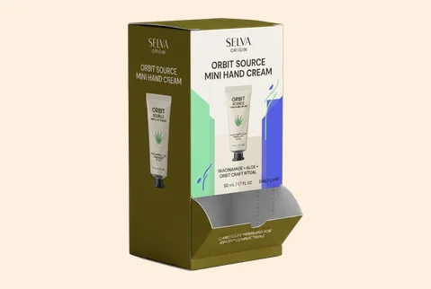
➜
Gravity-Feed Dispensers
A sloped or guided internal path lets suitable packets or small products move toward the access point as items are removed, supporting a tidier, more consistent dispensing position.
- Guided product movement
- Controlled front access
- High-visibility display panel
- Repeated retail dispensing
Keeps suitable products available while the outer box continues to communicate the range.
Customize Now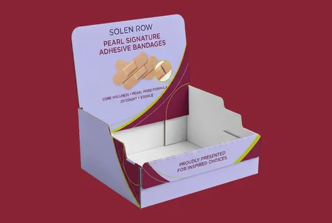
➜
Tear-Away Display Dispensers
A perforated panel can protect the contents during transport and convert the pack into a display-ready dispenser at setup, reducing the need for a separate counter unit.
- Transport-to-display conversion
- Planned perforation line
- Brand-preserving panel layout
- Fast retail setup
The closed pack converts into a presentable selling unit without losing its branded structure.
Customize Now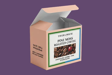
➜
Pop-Up Access Boxes
A top or front pop-up opening can give tissues, wipes, sleeves or lightweight wrapped products a clean removal point while keeping the remaining contents contained and visually organized.
- Product-matched access slot
- Neat one-at-a-time removal
- Printed top-panel branding
- Counter or shelf use
Suitable products stay easy to remove, with the brand visible around every access point.
Customize Now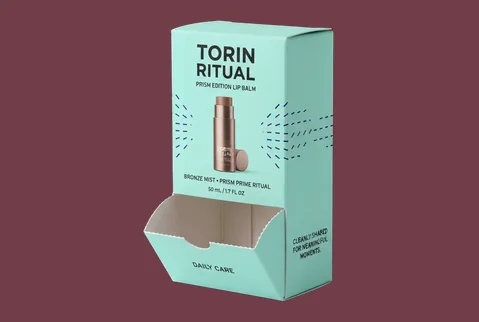
➜
Side-Opening Dispensers
Side access can support products that need horizontal removal or a lower reach point, while the front panel remains available for key product, variant and brand information.
- Horizontal product access
- Clear front-facing message
- Product-specific opening depth
- Shelf-efficient orientation
This route separates the customer access area from the main visual selling surface.
Customize Now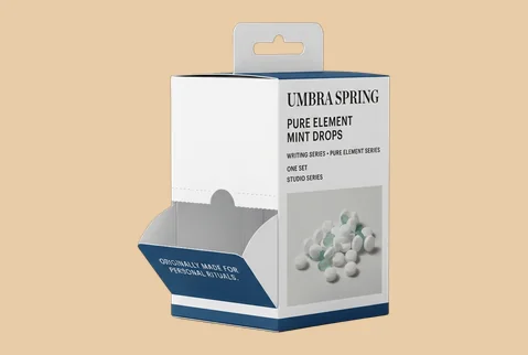
➜
Hanging Dispenser Boxes
A reinforced hang-tab area can place lightweight products at eye level or on peg displays, while a lower access opening lets customers take items without removing the whole box.
- Peg-display compatibility
- Reinforced hanging area
- Lower dispensing access
- Vertical brand visibility
Useful for compact products that need visibility, access and efficient use of retail space.
Customize Now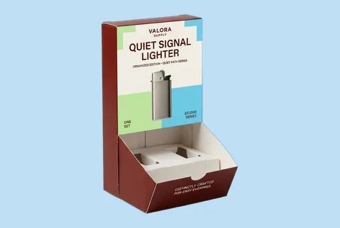
➜
Compartmented Dispensers
Dividers or shaped paperboard inserts can separate flavors, colors, sizes or product types inside one dispenser, making the range easier to understand before a customer selects an item.
- Multi-variant organization
- Paperboard divider system
- Clear selection sequence
- Coordinated range branding
One box can present a connected assortment without allowing the choices to feel mixed or unclear.
Customize Now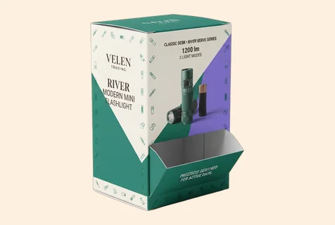
➜
Refill-Ready Dispensers
A structure planned around loading and replenishment can help staff refill the dispenser while preserving the customer-facing display, making it useful for recurring retail or service environments.
- Planned refill access
- Stable product arrangement
- Persistent front branding
- Ongoing service use
The display stays recognizable and usable as stock is replenished over time.
Customize NowMATERIAL-LED DISPENSING
Choose the Physical Character Behind the Display
Material influences whether a dispenser feels crisp and retail-ready, natural and tactile, substantial enough for repeated handling, or robust enough to convert from pack to display. It also affects print definition, edge quality, opening strength and how the box holds its shape as stock is removed. We help match the board to product weight, access method, channel and intended brand character rather than treating thickness as the only decision. The aim is a dispenser whose physical feel supports the promise made by its graphics and whose structure remains presentable as products are selected and stock is replenished.
SBS Paperboard for Crisp Retail Detail

Smooth SBS paperboard supports clean color, small typography and sharply defined product cues. It is a strong route for compact retail dispensers where accurate die-cutting, a neat access edge and a polished printed surface all contribute to a controlled, professional impression.

Kraft for a Natural, Tactile Character

Kraft can give a dispenser a warmer, more direct material presence. Dark ink, selective color or well-controlled white printing can keep the brand clear without hiding the board’s natural character, making it useful when the product story is craft-led, ingredient-led or intentionally understated.
Corrugated Board for Added Structure

Suitable micro-flute or corrugated constructions can add support for heavier products, repeated handling or transport-to-display use. The value is not commodity shipping-carton positioning; it is a branded dispenser that arrives with enough structure to convert into a presentable retail or service unit.
Rigid Greyboard for Selected Display Formats

For a selected reusable or high-touch dispenser concept, rigid greyboard can create a more substantial counter presence. Wrapped surfaces, controlled openings and optional interior organization can turn the unit into part of the environment, especially where the dispenser is intended to stay visible beyond a single product fill.
PRINT THE RANGE WITH PURPOSE
Make the Brand Clear Before the First Item Is Taken
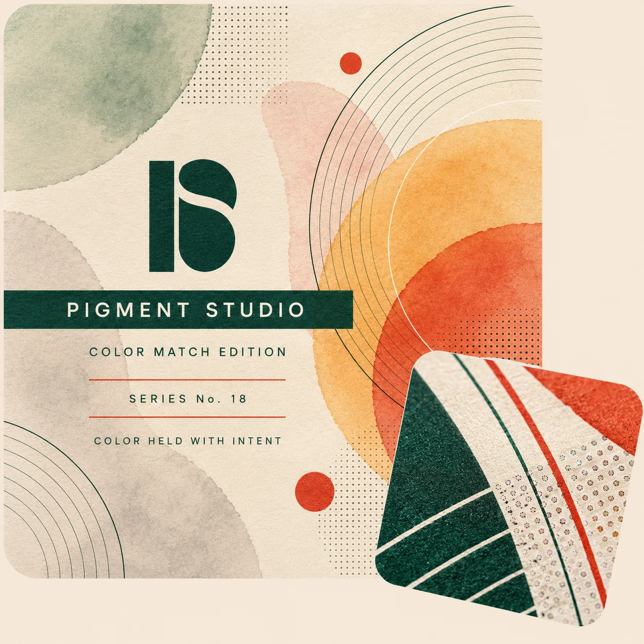
A dispenser box often remains in view longer than a standard folding carton, so its printed design must work before setup, after opening and while stock levels change. Use the header, front, sides and selected inside surfaces to explain the product, separate variants and keep the parent brand recognizable around the access point. Full-color artwork, controlled spot colors, white ink on kraft and relevant inside printing give the design room to adapt; the customer outcome is a dispenser that is easier to understand, more coherent as a range and still visibly yours after the first item is removed.
- Keep the parent brand visible after setup
- Turn product variants into an easy-to-read range
- Use the header as a recognition point
- Carry key cues around the access opening
- Continue selected graphics inside the dispenser
- Support recognition across counters, shelves and photography
FINISHES THAT GUIDE ATTENTION
Control What Shoppers Notice Before They Reach In
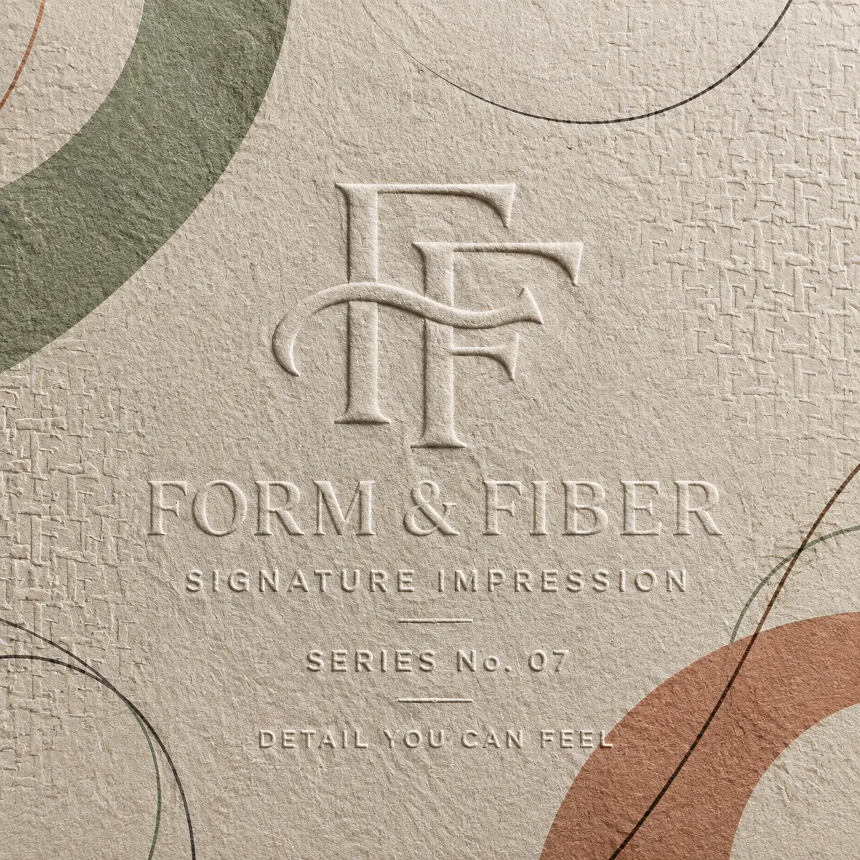
A dispenser box has several competing visual areas: the brand panel, product message, access point and any setup or opening cues. Finishes should create order between them, not decorate every surface equally. Matte, gloss, soft-touch, foil, embossing, debossing and raised effects can change what feels calm, energetic, tactile or important, but each treatment must also respect folds, perforations and dispensing edges. We help place contrast where it strengthens recognition and keep functional areas clear, so the surface treatment supports both the brand impression and the way the box is used.
-
 Set the Surface Mood
Matte or soft-touch treatment can make a wellness, beauty or professional range feel calmer and more tactile. Gloss can support stronger color and a more energetic retail character where fast recognition matters. The right choice should match the product world rather than follow a finish trend.
-
Give the Brand Mark Priority
Foil, embossing, debossing, spot UV or raised effects can give a logo, product name or variant cue more visual and tactile weight. Selective placement helps the key information lead the eye while the dispensing opening remains easy to see and use.
-
Separate Launches and Special Ranges
A limited edition, seasonal assortment or promotional run can use a controlled change in foil, texture or surface contrast to feel distinct. Keeping the core layout and brand cues consistent allows the new version to attract attention without looking disconnected from the parent range.



DESIGN THE DISPENSING MOMENT
Make Every Opening and Product Reach Feel Intentional
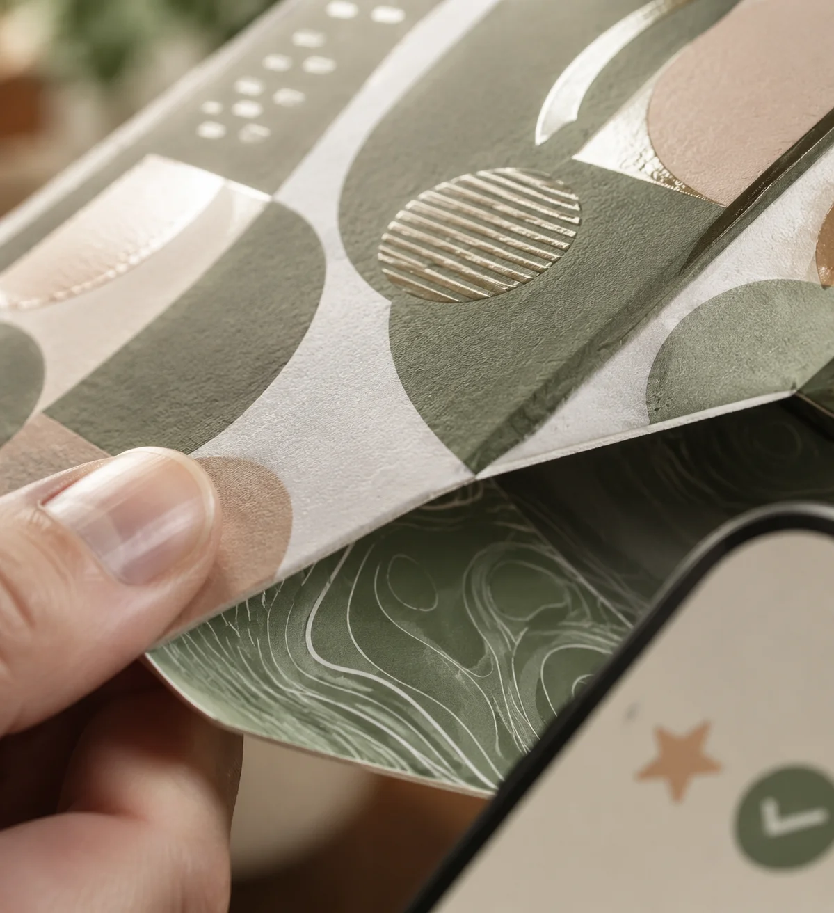
With a dispenser box, unboxing is not only the moment a closed pack is opened. It includes the first setup—when a panel is removed, folded back or the unit is loaded—and the customer’s first reach. The experience then continues through every pull or selection. If the interior, access point and remaining stock feel disconnected from the exterior promise, the brand loses coherence as soon as the box begins to work. We plan the setup, first reveal and ongoing dispensing sequence together, so the structure introduces the product clearly, keeps the assortment organized and gives the brand a useful role beyond the unopened pack.
-
Keep the Identity in View
Carry selected colors, graphics or concise messaging onto the header, sidewalls, back panel or relevant inside surface. The identity established on the closed pack should remain recognizable after a panel is opened or removed.
-
Make Access Self-Explanatory
Shape and position the opening so customers can understand where to reach and what they are selecting. Printed cues, dividers or a guided internal path can support the action without turning the box into a set of instructions.
-
Create a Satisfying First Setup
Use the first reveal to show an orderly product arrangement, a clear variant sequence or a well-framed first item. That setup moment gives staff and customers confidence that the dispenser was designed around the product rather than cut open as an afterthought.


EXPERT-GUIDED DISPENSER PACKAGING
Dispenser Box Customization Made Easy & Fast — Built to Hold, Dispense & Display
Our dispenser packaging experts, structural designers, print specialists, consultants, and project managers make custom dispenser box ordering easy and fast by bringing your product dimensions, unit count, dispensing direction, opening size, selected carton style, stock needs, artwork, label copy, and brand direction into one production-ready structure. We guide product stack height, row layout, packet, sachet, pouch, bar, card, tissue, or sample-fit clearance, tear-away or perforation path, front lip height, dispenser opening strength, base support, restocking access, stock thickness, coating and finish compatibility, retail-facing artwork placement, barcode or QR spacing, dieline alignment, bleed and safe-zone setup, cost calculation, timeline planning, prepress preparation, and 3D proof review. The result is a custom dispenser box that holds products neatly, dispenses more smoothly, presents artwork clearly, and moves to production with fewer sizing, opening, structure, print, or approval risks.

-
Fast
Specs-to-Quote Dispensing Alignment
Experts align product size, unit count, dispensing direction, opening style, stock thickness, artwork, label panels, finish choices, cost, timeline, prepress setup, and 3D proof early — helping reduce quote delays and approval back-and-forth.
-
Exact
Opening, Count & Product-Flow Review
We check product stack height, row arrangement, front lip height, opening width, product access, perforation path, base strength, and restocking needs so the dispenser holds the right count and releases products more cleanly.
-
Print-Ready
Front Panel, Tear-Away & Artwork Check
Print specialists review front-panel messaging, tear-away areas, side panels, header space, barcode or QR spacing, dieline alignment, bleed, safe zones, coating compatibility, foil, spot UV, embossing, and finish-mask setup so your dispenser artwork prints more cleanly on the finished structure.
Plan a Dispenser Box That Works Beyond the Mockup
A dispenser can look convincing in a flat render and still cause difficulty when the product is loaded, moved, set up or removed. Good planning connects the product, access action, display position, artwork and production route before final approval. Our team helps turn those decisions into a usable specification rather than expecting you to arrive with every structural answer already solved. The following checks reduce avoidable revisions and make it easier to compare options on fit, brand visibility, setup and order scale.
-
Start With the Product and the Customer Reach
Accurate planning begins with the finished item that will sit inside the dispenser. Measure its length, width and height with any wrapper, sleeve or inner pack included. Also note its weight, orientation, surface behavior and whether customers should take one item or several. A soft sachet, rigid carton, folded wipe and wrapped accessory will not move through the same opening in the same way.Share the intended pack count, loading direction and removal action as well. We use those inputs to plan internal space, access depth and removal clearance without guessing at dimensions. When the product is irregular, prone to snagging or likely to shift, a divider, insert, guided path or different access direction may be more dependable than simply enlarging the cutout.
-
Choose the Structure Around the Selling Channel
A countertop dispenser, shelf-facing unit, peg-display box and point-of-use supply pack solve different visibility and access problems. A counter format may benefit from a raised header and front opening. A shelf format may need a lower profile or tear-away panel. A hanging unit must preserve both the display area and the reinforced hang position.Choose one primary channel first, then confirm any supporting use such as product photography, handoff, transport-to-display or recurring service access. Trying to make one structure behave like every possible format can weaken the opening, crowd the artwork or add unnecessary complexity. Our team can compare routes against the actual customer encounter so the final style earns its place.
-
Plan Loading, Refill and Stock Behavior
The closed box, first setup and partly used dispenser should all be considered before production. Decide who loads it, whether a panel is removed or folded back, how staff refill it and what customers see as stock drops. Gravity-feed products may need a guided internal path; mixed variants may need compartments; lightweight items may need containment near the opening.This planning protects more than function. It helps the display remain tidy and keeps the brand panel visible throughout use. A dispenser that works only when completely full can lose both convenience and visual confidence too early.
-
Protect the Artwork Around Cuts, Folds and Openings
Design on the approved dieline, not on a generic rectangle. Perforations, glue areas, folds, access slots and removable panels can interrupt a logo, product name or required information if they are treated as an afterthought. We help identify which surfaces remain visible before setup, after conversion and during dispensing, allowing the brand hierarchy to be distributed across the header, front, sides, top or relevant inside panels.Exterior and interior printing, controlled brand colors and white ink on kraft can all support the concept where the selected material and structure allow. The useful outcome is continuity: customers should still know whose product they are reaching for after the dispenser is open and partly used.
-
Move From Dieline to Confident Approval
Dieline and template support is available, along with artwork checking, resizing, bleed and safe-zone guidance. Production files can be supplied in AI, PDF, PSD or EPS format. We review the artwork against the approved structure, and a digital proof is available for every approved order so you can check placement and content before printing begins. There is no separate die or plate fee.A digital proof confirms the approved artwork and production layout; it is not a physical sample. For a qualifying bulk or wholesale project, a physical prototype may be available, and its cost may be adjusted into the resulting order where approved. That route is useful when product movement, a new opening mechanism or a high-value rollout justifies physical evaluation.
-
Set the Quantity, Schedule and Delivery Plan
Paperboard, cardstock, kraft and supported corrugated dispenser orders may start from 50 boxes. Supported rigid-box formats may start from 25. These starting quantities can still include relevant custom sizing, printing, finishes and interior organization, subject to the approved structure and production specification. Per-unit pricing generally improves as volume increases, with more visible differences often appearing around 500 units.Production normally takes 4–6 business days after payment, final artwork approval and structure confirmation. Production-ready jobs are generally planned to print and ship within 7 business days. Shipping transit time is separate, while complex multi-design orders may require a separately confirmed schedule. This is a production-and-ship plan, not a promise of seven-day delivery.Tell the team early when an order includes many designs, staged launches or delivery to several addresses. We can plan bulk handling, multi-address shipping and white-label or design-firm workflows around a confirmed schedule rather than discovering those requirements after approval.Bring the product, intended channel, approximate quantity and current artwork to the first conversation. We will help identify the decisions that affect fit, dispensing behavior, visible brand surfaces and production, then turn the chosen route into a dieline and proof you can review with confidence.

DISPENSER BOX QUESTIONS
Answers Before You Size, Print and Produce
Dispenser boxes can suit many individually wrapped, stacked, folded or lightweight products when the item can be reached through a controlled opening. Typical possibilities include sachets, packets, wipes, sleeves, samples, small accessories and point-of-use supplies. The right structure depends on the product’s finished dimensions, weight, wrapper friction, orientation and whether one item or several should be accessible at once. Sharing the actual product or a production sample gives the structural team the best basis for planning the opening and internal path.
Yes. The opening can be developed around your product and the intended reach instead of forcing the item through a stock cutout. We use the finished length, width and height, inner or outer wrapping, orientation, pack count, weight and needed removal clearance to plan the structure. An irregular product or one that tends to snag may need a guided path, divider, insert or different access direction. The goal is comfortable removal without making the opening so large that the remaining stock looks loose or the front panel loses its branding role.
Guidance is available, and the best style starts with where the box will be seen and how people will reach it. A countertop format may use a front opening and raised header; a shelf unit may use a tear-away panel or lower profile; a hanging dispenser may combine a reinforced hang area with lower access. We also consider transport, staff setup, refilling and what remains visible as stock is used. This makes the choice easier to defend than selecting a structure from appearance alone.
Yes. The artwork can be planned so the logo, range name, variant cue and key product information remain visible after a perforated panel or access section is opened. The header, back panel, sidewalls, top and relevant inside surfaces can share the message instead of placing everything on a removable piece. Exterior and inside printing are available, including controlled spot colors and white ink on kraft where suitable. A dieline-based artwork check helps protect that hierarchy before production.
Yes. A growing brand can start with a dispenser designed around its own product without committing to a large first run. Paperboard, cardstock, kraft and supported corrugated orders may begin at 50 boxes, while supported rigid formats may begin at 25. Relevant custom sizing, exterior or interior printing, finishes and inserts remain available at these starting quantities where they suit the approved structure and production specification. This gives you room to test a launch or retail concept without settling for a generic stock dispenser.
Yes. A digital proof is available for every approved order before printing begins. Free dieline or template support, artwork checking, resizing, bleed and safe-zone help are also available, and production files can be supplied in AI, PDF, PSD or EPS format. The digital proof lets you review placement on the approved structure, but it is not a physical sample. For a qualifying bulk or wholesale project, a physical prototype may be available, with its cost adjusted into the resulting order where approved.
Production normally takes 4–6 business days after payment, final artwork approval and structure confirmation. Production-ready jobs are generally planned to print and ship within 7 business days, but shipping transit time is separate. An order with many short-run designs or a more complex setup may need a separately confirmed schedule. The team will identify that before the job moves ahead, so the production plan reflects the actual structure, artwork and order mix rather than an unsupported delivery promise.

CUSTOMER SUCCESS STORIES
Hear What Our Customers Say

As a small business, finding premium finishes in lower quantities was always difficult. Global Custom Packaging gave us the freedom to customize our boxes and create the distinctive, polished look we wanted without committing to a large order. We still work with them today and have expanded into multiple product variants, each with the same impressive presentation.
Jordan Blake
We sell online and in stores while regularly promoting at major events, running influencer campaigns, and launching seasonal collections. Thunder Packaging has become our dependable source for everything—from premium mailer and product boxes to sturdy influencer kits, rigid packaging, kraft boxes, and limited-edition Christmas designs. Whatever structure, material, or branded look we need, we no longer have to go anywhere else.
Avery Quinn

I never worry about how my packaging will look or whether my artwork contains typos, incorrect bleed areas, or other design errors. Their 3D previews and helpful design support give me confidence before printing. If the team notices a problem, they contact me, correct it quickly, and never charge extra for the assistance.
Cameron Reese
I’m really impressed with Global Custom Packaging’s precise, richly saturated printing and the accuracy of their die-cutting. The boxes were produced in exactly the right size, with a clean, well-formed structure and no fitting or construction issues. The finished packaging looked polished, consistent, and ready to represent our products professionally.
Morgan Taylor
I received my quote within a few hours, and once we agreed on the price, the designer responded quickly, completed the required changes, and prepared my artwork for printing. The 3D proof arrived promptly, allowing me to review everything and place my order that same day. My packaging was delivered on time, exactly as Global Custom Packaging had committed.
Harper Lane