


-

Low Starting Quantity
-

Digital Proof Included
-

Design Support Available
-
In-House Production
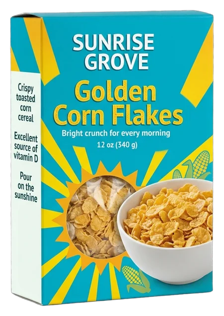
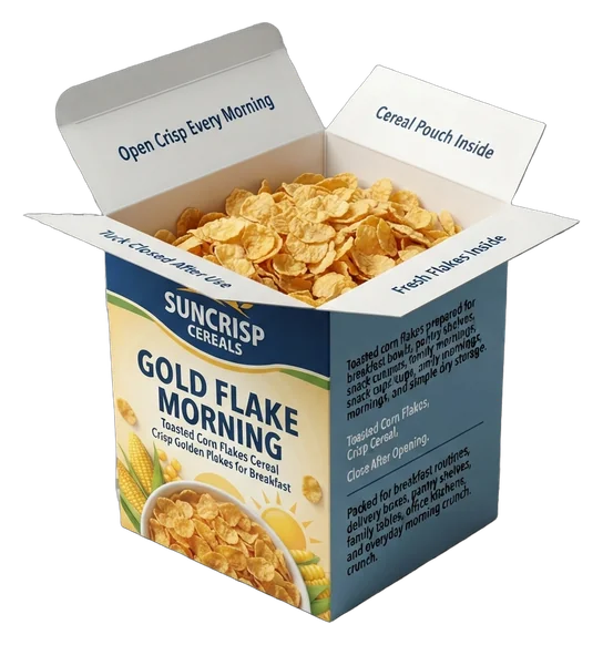
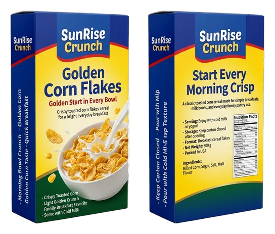
Give your corn flakes a clear, appetizing retail identity designed to help shoppers recognize the product, understand the range, and carry the same brand impression from shelf to opening. Breakfast shelves often place many familiar formats and bold graphics within a small field of view. Custom corn flakes boxes let you organize color, product naming, imagery, and information panels around the way your brand should be understood. The result can be a cleaner front-panel hierarchy, more consistent recognition across flavors or pack sizes, and a more considered carton from the first shelf glance to the moment the top flap opens. We help you build a carton that feels specific to your product rather than adapted from a generic template. By coordinating the structure, board character, print coverage, surface treatment, and inside details where relevant, we shape a box that supports your retail position and the standard you want customers to associate with your cereal. Your packaging plan can be developed around the dimensions of the real inner pack, the preferred tuck or bottom style, the panels that need artwork or product information, and the way each variant should remain connected to the parent brand. Supported paperboard and kraft routes, full-color and spot-color printing, inside or outside print, selective finishes, dieline assistance, artwork checks, and digital proofing provide the practical path from concept to an approved production file.

Get Custom Quote
CARTON ROUTES BY PURPOSE
Choose a Structure That Fits the Pack
A corn flakes carton should match the way the product is packed, displayed, handled, and opened. A familiar tuck style may suit a straightforward retail pack, while an auto-bottom route can support a different approved packing configuration. A window can become part of the design when the inner pack and viewing area are planned together. We help you compare these routes against the real product dimensions, artwork needs, selected board, and intended channel so the final structure feels purposeful rather than chosen from a generic style list.

➜
Straight Tuck Cartons
Choose a straight tuck route for a familiar cereal-carton format built around your supplied product and inner-pack dimensions. Coordinated panels give the brand, variant name, imagery, and information areas a clear place.
- Matching tuck-end direction
- Sized around the actual pack
- Full exterior print coverage
- Optional inside printing
The result is a recognizable retail structure shaped around your own product and visual system.
Customize Now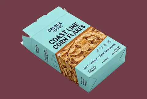
➜
Reverse Tuck Cartons
A reverse tuck structure gives you another supported carton route when opposing end closures better match the approved dieline and packing plan. The full surface can still carry a connected, product-specific brand story.
- Opposing tuck-end route
- Fit planned from dimensions
- Front-to-back brand continuity
- Retail or promotional use
Structure and artwork work together, helping the finished carton feel deliberate from every viewed panel.
Customize Now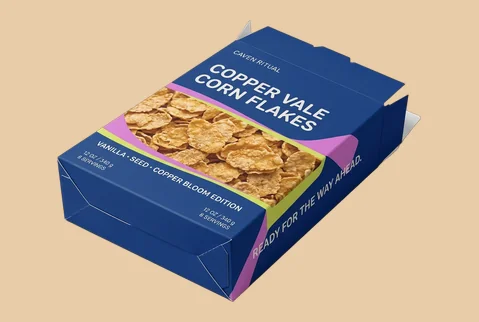
➜
Auto-Bottom Cartons
Select an auto-bottom format when that base style suits the confirmed product, packing method, and production specification. We coordinate its proportions with the artwork so the carton remains visually balanced and brand-led.
- Auto-bottom structural option
- Product-specific size planning
- Exterior print across panels
- Selected finishes available
A coordinated base, size, and print plan keeps the carton aligned with the intended brand standard.
Customize Now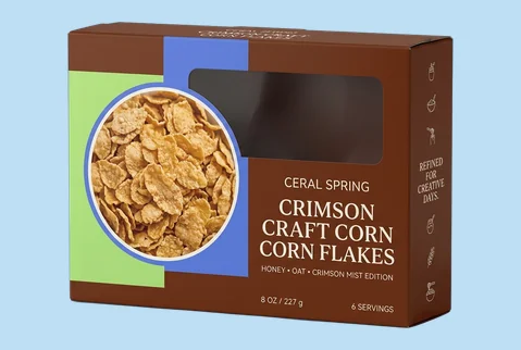
➜
Window Corn Flakes Boxes
Add a die-cut window or window patch when a viewing area genuinely supports the pack concept and the inner product arrangement. Its shape, position, and surrounding artwork should be planned as one composition.
- Custom die-cut window shapes
- Window patching available
- Artwork frames the viewing area
- Use depends on pack layout
The reveal becomes part of the design without separating the carton from the wider cereal range.
Customize NowBOARD FEEL SETS THE TONE
Choose a Carton Character That Fits the Brand
The board establishes how substantial, bright, natural, or refined the corn flakes carton feels before a shopper studies the artwork. The right choice depends on the visual character you want, the approved structure, the real pack dimensions, and the print treatment required across the panels. Smooth paperboard can support cleaner image and color definition, kraft can create a more natural or craft-led identity, and corrugated material can extend the same brand into a relevant presentation or mailer format. Choose the material for the impression and use case it must support, not by thickness alone.
SBS Paperboard for Clean Visual Definition

SBS paperboard can support cereal artwork that depends on bright color, detailed imagery, controlled brand tones, and clearly separated information areas. Its smoother character gives the printing system a suitable base for a crisp, organized appearance across front, side, and back panels. Choose this route when the brand should feel polished, colorful, or confidently retail-led. The final board specification should still be selected around the carton dimensions, structure, print coverage, and intended physical character.

Kraft for a Natural, Craft-Led Identity

Kraft paperboard can give a corn flakes carton a warmer and more natural visual character. It can suit brands that want the material itself to participate in the design rather than disappear beneath full surface coverage. Brand colors, selected graphics, and white ink can be used to create contrast against the kraft surface. The purpose is not to make an unsupported environmental claim. It is to give the carton a recognizable material-led identity that fits the product and brand direction.
Corrugated for Relevant Presentation Formats

Corrugated material can extend the cereal brand into a relevant promotional box, presentation pack, product kit, or branded mailer format. It is most useful when the project requires a different physical character from the standard retail carton while still carrying coordinated artwork and brand cues. Choose this route only when it fits the product configuration and channel. The structure, flute selection, size, and printed treatment should be confirmed as part of the production specification rather than assumed from a standard shipping carton.
FLAVOR, RANGE & BRAND
Make Every Corn Flakes Variant Easy to Read
A customer may first understand a corn flakes product through its brand name, variant cue, imagery, and information hierarchy on the outer carton. Custom printing lets you bring those elements into one connected visual system. Give each flavor or pack size a clear point of difference, keep the parent brand consistent, and use the side and back panels as part of the same design rather than as disconnected information areas. Full-color CMYK, PMS or spot colors, digital, offset, flexographic, white-ink, and inside-printing routes provide production options. The customer value is a cereal range that feels coordinated, easier to navigate, and deliberately built around one recognizable brand.
- Give each flavor a clear visual cue
- Keep parent-brand elements consistent
- Use every panel with purpose
- Build seasonal packs around the moment
- Continue selected brand cues inside
- Stay recognizable across chosen channels
SURFACE CUES WITH PURPOSE
Control What Shoppers Notice and Feel First
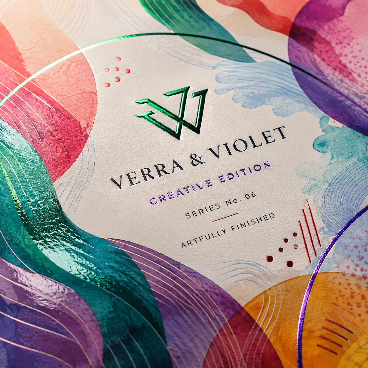
A corn flakes box can use several finishes and still feel visually unfocused. The better approach is to decide what the surface should communicate before selecting a treatment. A finish may make the overall carton feel calmer or brighter, direct attention toward the brand name or variant cue, or distinguish a seasonal edition from the core range. Matte, gloss, soft-touch, spot UV, foil, embossing, debossing, and raised effects should earn their place by supporting the intended product character—not by adding decoration to every available panel.
-
 Set the Overall Surface Mood
Matte or soft-touch treatment can support a calmer, more considered cereal identity when the brand direction calls for reduced glare or a softer hand feel. Gloss can suit brighter artwork where stronger surface clarity and energetic color are part of the intended character. The right choice depends on what the carton should communicate as a whole. The finish should support the artwork, not compete with it.
-
Direct Attention to Important Brand Cues
Spot UV, foil, embossing, debossing, or raised effects can give selected elements greater visual or tactile weight. These treatments may be applied to a brand mark, product name, variant cue, or other approved design element that should receive attention first. Selective use creates a clearer hierarchy. Covering too many elements with competing effects can weaken the purpose of the finish.
-
Give Special Editions a Distinct Role
A seasonal, promotional, or limited cereal edition can use surface contrast to feel different from the everyday range while remaining connected to the same parent brand. A selective foil, raised detail, spot treatment, or alternate lamination may provide the distinction. The business value comes from creating occasion relevance without making the special pack look unrelated to the core product family.


KEEP THE EXPERIENCE CONNECTED
Carry the Brand From the Shelf to the First Open
The outside of a corn flakes carton establishes an expectation, but the opening should not feel visually disconnected from it. For a standard retail box, the structure and artwork can guide the customer from the top panel to the inner pack in a clear, familiar sequence. For a promotional set, variety configuration, or relevant presentation format, printed inside surfaces, inserts, or dividers can help organize what appears after opening. The objective is not to create unnecessary theatre. It is to keep the product identity clear and considered from the first exterior view through the initial reveal.
-
Continue Keep the Identity Present
Carry a relevant color, graphic element, or short brand message onto an inside flap or selected internal surface where it will genuinely be seen. This keeps the visual language established on the outside present during the first opening. Inside printing should have a clear role. It may reinforce the brand, introduce the product, or connect the opening to a campaign, rather than repeat exterior artwork without purpose.
-
Guide Make the Opening Route Clear
Use the approved structure and panel artwork to make the intended opening point easy to understand. The top panel, tuck area, and nearby graphics should work as part of the same composition instead of feeling like unrelated surfaces. For a variety or promotional configuration, dividers and inserts may be used to keep multiple items visibly organized. The arrangement should reflect the product count and supplied dimensions.
-
Reward Shape a Connected First Reveal
For a standard carton, the first reveal can lead cleanly from the outer brand story to the inner pack. For a promotional kit or selected multipack, the arrangement can control which item or message appears first. The result is a more connected introduction to the product—without implying that every corn flakes box needs an elaborate unboxing sequence or repeated-opening feature.


EXPERT-GUIDED CORN FLAKES PACKAGING
Corn Flakes Box Customization Made Easy & Fast — Built to Fit, Protect & Sell
Our cereal packaging experts, structural designers, print specialists, consultants, and project managers make custom corn flakes box ordering easy and fast by bringing your filled inner-bag dimensions, net weight, flake volume, selected carton style, artwork, and brand direction into one production-ready structure. We guide bag-fit clearance, flake-settling allowance, crush and movement control, top and bottom closure strength, shelf stacking, stock thickness, moisture- and scuff-resistant coating options, and nutrition, ingredient, allergen, barcode, QR, batch, date, and serving-panel spacing where required. We also manage dieline alignment, bleed, safe zones, color setup, cost calculation, timeline planning, prepress preparation, and 3D proof review. The result is a corn flakes carton that fits the filled liner, supports retail handling, presents product information clearly, and moves to production with fewer sizing, print, structure, or approval risks.

-
Fast
Specs-to-Quote Alignment
Experts align inner-bag size, net weight, selected carton style, stock, coatings, artwork panels, cost, timeline, prepress setup, and 3D proof early—helping reduce repeated corrections before approval.
-
Exact
Filled-Bag & Carton-Fit Review
We check bag width, height, gusset depth, fill volume, flake-settling allowance, seal clearance, carton depth, flap dimensions, and board thickness so the packed cereal fits without excessive pressure or wasted space.
-
Shelf-Ready
Structure, Label & Artwork Check
Specialists review shelf-facing panels, side-wall strength, nutrition and ingredient areas, barcodes, QR codes, small text, color setup, folds, glue tabs, and finish masks for cleaner retail presentation and production.
Plan Your Corn Flakes Carton With Confidence
A strong corn flakes carton starts with decisions that match the real product, packing process, artwork, and order plan. The steps below help you move from an initial idea to an approved production specification without relying on guessed dimensions or generic layouts. They also show where our team can support sizing, structure selection, dieline preparation, proofing, quantity planning, and production scheduling.
-
Size the Carton Around the Real Pack
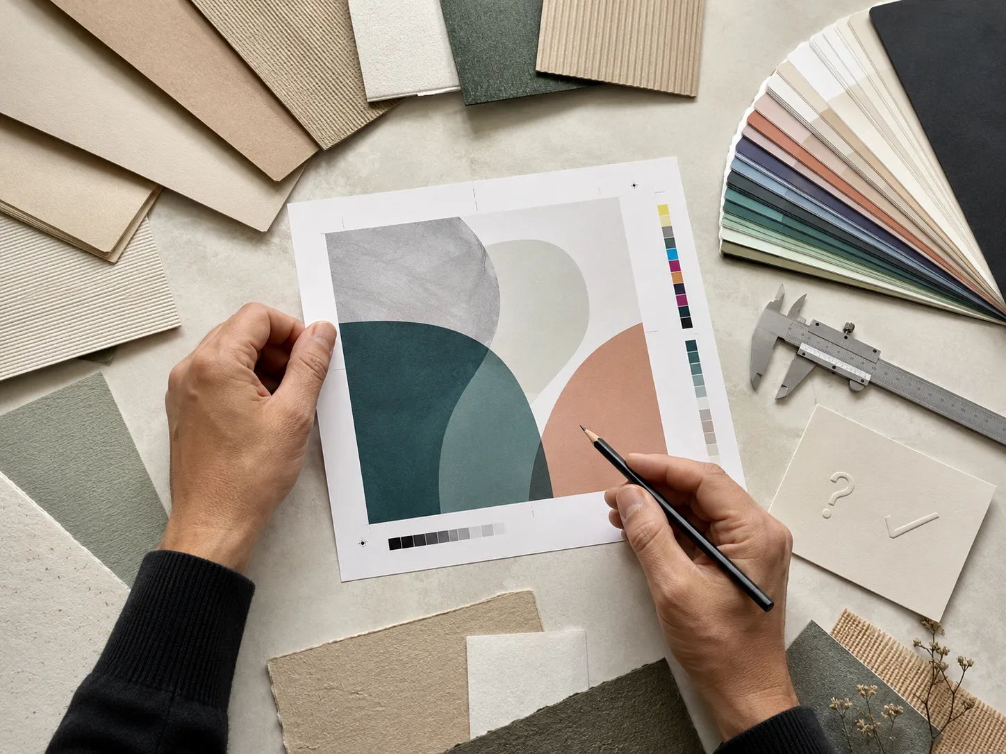
Begin with the product configuration that will actually go inside the box. Provide the length, width, and height of the inner pack, plus any wrapping, folded areas, pack count, or removal clearance that may affect the fit. Where the shape or fill level is not perfectly uniform, share the physical pack or the most reliable measurements available rather than estimating from a competitor carton. We use those inputs to develop the box dimensions and dieline around your approved structure. No fixed cereal-box dimensions should be assumed before the product, board, and packing arrangement are confirmed. This approach helps avoid a carton that feels unnecessarily loose, strains at the folds, or leaves the artwork working against the final proportions.
-
Match the Structure to the Channel
Decide where the carton must do its main work. A straight or reverse tuck route may suit a familiar retail format, while an auto-bottom option may be selected for a different approved packing plan. A die-cut window or window patch can be considered when the viewing area fits the inner-pack arrangement and the wider brand concept. Also identify whether the same design system must extend into a promotional, presentation, or relevant corrugated mailer format. The goal is not to force one structure into every situation. It is to keep the parent brand recognizable while choosing the format that fits each channel, packing method, and opening moment.
-
Plan Every Panel Before Artwork Is Final
Map the front, side, back, top, and bottom panels before treating the carton as a single flat canvas. Decide which element should be recognized first, how flavor or pack-size variants will differ, and where product information supplied by your team must appear. Inside printing can be added where it supports the opening experience, but it should serve a clear purpose rather than add decoration without value. Our team can check artwork, resize it for confirmed dimensions, and help with bleed and safe zones. Buyer-supplied legal, nutritional, ingredient, barcode, or other required information remains the buyer’s responsibility, so those details should be finalized and reviewed by the appropriate party before approval.
-
Use the Dieline and Proof to Remove Guesswork
A free dieline or template is available, and production files can be supplied in AI, PDF, PSD, or EPS format. Design support and artwork checking are also available. Once the structure and dimensions are confirmed, place artwork on the correct dieline rather than adapting a flat front-panel concept at the last moment. A digital proof is available for every approved order. Review the panel order, copy, colors represented in the proof, cut and fold positions, and any inside-print or finish callouts before authorizing production. A digital proof is not a physical prototype. For a qualifying bulk or wholesale project, a physical prototype may be available, with its cost potentially adjusted into the resulting order where approved.
-
Plan Quantity, Pricing and Production Together
Supported paperboard, cardstock, kraft, and corrugated orders may start from 50 boxes. A low starting quantity does not automatically remove relevant customization choices, although every option remains subject to the approved structure and production specification. Per-unit pricing generally improves as quantity increases, with more visible price differences often appearing around 500 units. For a useful quotation, provide Required quantity; Confirmed or estimated dimensions; Product and inner-pack configuration; Preferred material; Exterior and interior print coverage; Finish requirements; Number of artwork versions; and Intended delivery destination. Production normally takes 4–6 business days after payment, final artwork approval and structure confirmation. Production-ready jobs are generally planned to print and ship within 7 business days. Shipping transit time is separate, while complex multi-design orders may require a separately confirmed schedule. No die or plate fee applies to supported orders. The production clock does not begin before the required payment, approvals, and structure confirmation are complete. Bring the actual pack details, brand files, intended channel, and target quantity into the conversation early. That gives the team the information needed to recommend a practical structure, prepare the correct dieline, and quote the job against an approved specification rather than assumptions.

CORN FLAKES BOX QUESTIONS
Answers Before You Size, Print and Order
Yes. The carton can be planned around the product configuration you actually use. Share the inner pack’s length, width, and height, along with any folded areas, wrapping, pack count, or removal clearance that affects the fit. The team can then prepare the structure and dieline around those inputs instead of relying on a generic cereal-box size.
Straight tuck, reverse tuck, auto-bottom, and window-box routes are available for consideration. The right choice depends on the approved dimensions, packing method, artwork plan, and opening experience you need. A window should be used only when its shape and placement work with the inner-pack arrangement. The team can help compare the available structures before the dieline is finalized.
Yes. Printing can cover the front, back, sides, top, bottom, outside, and inside where the approved structure allows it. Full-color CMYK, PMS or spot colors, digital, offset, and flexographic routes are available. Inside printing is most useful when it continues a clear brand cue or supports the first opening, rather than adding detail that customers may never see.
Yes. Supported paperboard, cardstock, kraft, and corrugated orders may start from 50 boxes. At that starting quantity, relevant sizing, print coverage, material, finish, and inside-print choices can remain available, subject to the approved structure and production specification. This gives a growing brand a practical way to test a launch, prepare a limited run, or introduce a new variant without defaulting to a generic stock carton.
Yes. A free dieline or template, artwork checking, resizing, bleed and safe-zone assistance, and design support are available. Production files may be supplied in AI, PDF, PSD, or EPS format. Share the confirmed product measurements and brand assets first so the artwork can be prepared on the correct structure instead of being forced onto an unapproved layout later.
Yes. A digital proof is available for every approved order, and production should not begin until the required approval steps are complete. Use the proof to review panel order, copy, artwork placement, cut and fold positions, inside-print instructions, and finish callouts. A digital proof is not a physical prototype. A physical prototype may be available for a qualifying bulk or wholesale project under separately approved terms.
Production normally takes 4–6 business days after payment, final artwork approval and structure confirmation. Production-ready jobs are generally planned to print and ship within 7 business days. Shipping transit time is separate, while complex multi-design orders may require a separately confirmed schedule. Final timing should therefore be agreed against the approved structure, artwork versions, and production requirements rather than treated as guaranteed delivery within seven days. Section 8 is currently written in paragraphs so it remains compatible while FAQ bullet-and-list support is still unresolved.
CUSTOMER SUCCESS STORIES
Hear What Our Customers Say

As a small business, finding premium finishes in lower quantities was always difficult. Global Custom Packaging gave us the freedom to customize our boxes and create the distinctive, polished look we wanted without committing to a large order. We still work with them today and have expanded into multiple product variants, each with the same impressive presentation.
Jordan Blake
We sell online and in stores while regularly promoting at major events, running influencer campaigns, and launching seasonal collections. Thunder Packaging has become our dependable source for everything—from premium mailer and product boxes to sturdy influencer kits, rigid packaging, kraft boxes, and limited-edition Christmas designs. Whatever structure, material, or branded look we need, we no longer have to go anywhere else.
Avery Quinn

I never worry about how my packaging will look or whether my artwork contains typos, incorrect bleed areas, or other design errors. Their 3D previews and helpful design support give me confidence before printing. If the team notices a problem, they contact me, correct it quickly, and never charge extra for the assistance.
Cameron Reese
I’m really impressed with Global Custom Packaging’s precise, richly saturated printing and the accuracy of their die-cutting. The boxes were produced in exactly the right size, with a clean, well-formed structure and no fitting or construction issues. The finished packaging looked polished, consistent, and ready to represent our products professionally.
Morgan Taylor
I received my quote within a few hours, and once we agreed on the price, the designer responded quickly, completed the required changes, and prepared my artwork for printing. The 3D proof arrived promptly, allowing me to review everything and place my order that same day. My packaging was delivered on time, exactly as Global Custom Packaging had committed.
Harper Lane