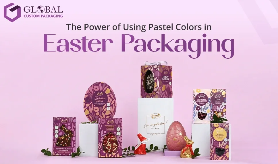
What comes to your mind when you first hear about Easter? Fluffy white rabbit tails and hot cross buns, of course, but there is one more thing that you can never ignore. Well, we are talking about bright-pastel eggs! The soft colors of spring are not only a marketing tool but also are deeply spiritual and symbolic. And the most interesting fact is that in 1198, Pope Innocent III wrote a treaty based on the Song of Solomon that created the drive for Easter color symbolism evident in Easter festivities today.
Did you know that yellow pastels remain the popular choice for Easter colors in the USA, while blue is also rising to become the most trending shade (DoorDash report)? Additionally, Instacart reveals that Easter candy in shops and online markets is often recognised by playful, light-tone designs and soft pastel packaging.
In today's blog, we are going to reveal how pastel colors in Easter packaging can attract customers and upscale your sales this festive season. Also, we are going to share pastel color theory and how this palette has been associated with Easter throughout history. So if you are planning to launch products this Easter, then don't forget to read the blog till the end!
A pastel colour palette is indeed a trendy and aesthetic choice that elevates and complements any space, which makes it ideal for both summer and spring months. But travelling back to history, liturgical colours had been chosen by the Catholic Church to capture the true spirit of Easter festivities.
As the years passed by, these traditional colors were blended with bright, vibrant colors to uplift the colors of spring, and a perfect mix of these shades is embodied through Easter treats and packaging, and is adored by everyone!
As Wassily Kandinsky notes, color is a power which directly influences the soul, and Robin Williams puts forward that spring is nature's way of saying, 'Let's party!' Pablo Picasso quotes it right: colors, just like features, always follow the changes of emotion.
As spring is just around the corner, the colours associated with it are blooming as well. The new Easter color palette is filled with both sweet and soft pastel colors to entertain its audience while decorating the Easter-inspired boxes pretty well. Spring colors speak through nature, and are truly inspired by them.
Here is a list of some classic colors of the Easter festival and their connotations. Let's begin!
Lavender reflects purity and is a symbol of love that is found in the Easter narrative. According to Charmetant, it's a color that artists favor for its mystical qualities, eliciting a sense of tranquillity and spiritual renewal! This quote defines that, since history, the lavender color has been associated with peace and tranquillity, thus defining the true meaning of the Easter festival and celebrations.
Pink is the most used and classic color associated with Easter, and it expresses joy & love. The pastel palette without pink is certainly incomplete, and it adds warmth and charm to your Easter-themed packaging decor. If we look at history, pink is worn by clergy on the 3rd and 4th weekends of Lent to remind others to stay joyful during the times of penance.
Adding a pink tone to your Easter products and packaging will absolutely symbolise a cheerful vibe for your customers and would be ideal for gifting as well!
Violet is attributed with a soft, elegant feel and premium luxury. It is often used for exclusive gift boxes and makes the products packed inside feel refined and special. Traditionally, it is considered a significant color that represents humility, melancholy & penance. To honour Jesus' temptation, resistance, and willpower for the period of 40 days in the altars, lecterns & deserts & pulpits are usually adorned with purple pieces of cloth in churches.
The color holds symbolic value as it is also a reminder of Jesus' crucifixion and suffering, as he was requested to wear a royal purple robe by the Romans, as they declared him the ‘King of the Jews’. The violet color also balances and beautifully pairs with yellow, pink, mint, and blue & mint, which is perfect for a colorful packaging box if your brand theme is associated with kids' accessories or a rainbow theme!
Yellow is one of the colors that reflects the emergence of spring at its best. With the sun shining above our heads and sunflowers and daffodils dancing and blooming across the land, the vibrance of yellow color fills the air with pure joy and happiness. Traditionally speaking, yellow, along with gold paired with white, connotes the resurrection of Jesus Christ, giving a ray of hope with a sense of enlightenment.
You can pair up yellow pastels with other pastel tones to create vibrant Easter packaging. The subtle yellow tone will bring warmth to your products' packaging, while a hint of gold paired with white will define the Easter celebration quilt elegantly.
Green is the color associated with nature; it is the color of hope and a symbol of eternal life. The green color is worn by priests after Easter’s farewell to remind each individual to carry on their life with hope and be a part of nature; it wishes them a victorious and glorious year ahead.
The green color can be used in two tones for your products' boxes: olive green to show a pinch of nature and mint green as a contrast to include a celebratory vibe to your packaging. As spring and Easter come together, green is the color your brand doesn't want to miss, as it deeply represents the Easter celebration at its best!
The excitement as a child to wake up and see a pastel-inspired Easter basket, and likewise, lighting the candles of the Hanukkah menorah, always stays in our heads, and our minds capture and associate colours with memories. The power of color can transport us back to old times within a span of a few minutes.
Color associations can make us relive our past experiences, so it plays a great role while deciding your product's packaging, especially for the Easter holidays. As shades of pastels highlight Easter festivities for a long time, it might help you to grasp your customers' attention because of familiarity!
As Easter is a celebration of joy, hope, and renewal, adding elements will reflect symbolism, but the color theme will mingle to reflect complete Easter vibes. Your brand can enhance the seasonal appeal of your packaging by adding a mix of pastel shades. The spring environment can be reflected perfectly through incorporating pastel colors in Easter packaging.
In this blog, we have provided you with insights about how pastel colors play their role in Easter celebrations and how your brand can incorporate them to grab the attention of customers. Here at Global Custom Boxes, we have some unique candy boxes available, and the great news is that they are completely customisable. Order now through our website!
Unlock the retail potential of your product with your one and only reliable packaging partner - Global Custom Packaging. With our packaging knowledge and marketing expertise, we are set to empower your business to the heights of success. A perfect blend of style and durability, our custom packaging creates a distinctive brand identity for businesses of all sizes. So, contact us right now!
Copyright 2026. www.globalcustompackaging.com Project By GCP. All rights reserved.

